Sparklines are miniature charts that you can create within a cell.
These are quite useful when you’re creating a dashboard and want to quickly show a trend, seasonal increase or decrease, or outliers (maximum/minimum) visually.
According to Wikipedia – a sparkline is a small graphic designed to give a quick representation of numerical or statistical information within a piece of text, taking the form of a graph without axes.
This concept of Sparkline was introduced by Edward Tufte in 2006 and it became really popular when it became an inbuilt feature in Excel spreadsheets from the Excel 2010 onwards.
Enough of history!
Let’s get to the point on what sparklines can do in the real world and how to use it in Google Sheets.
Before I get into the nitty-gritty of creating a sparkline chart in Google Sheets, let me first show you a very simple example of a sparkline.
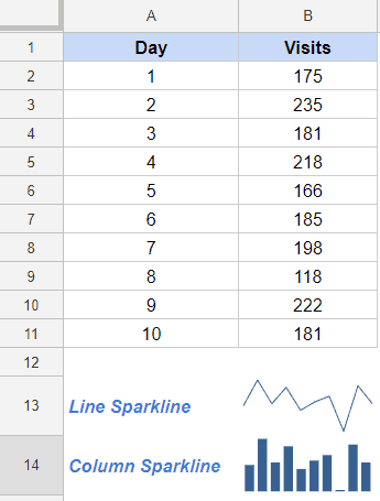
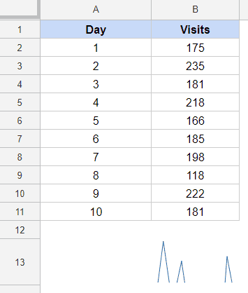
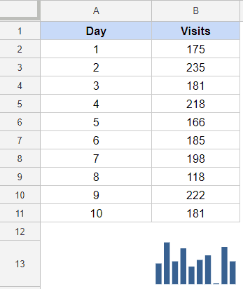
Below is a data set for websites visit of a site for 10 days, and the same has been shown as a sparkline chart (line chart and column chart).
Sparkline is a quick way to make boring data visual and help a user/reader quickly asses the trend or visually see any outliers. In the charts above, you can see that there was a dip in traffic on the eighth day.
The above example is a basic sparkline that you can create in Google Sheets. There are many variations that you can create for the above-shown sparklines.
NOTE: Excel and Google Sheets handle sparklines very differently. While in Excel it’s a feature that you can access using the options in the ribbon, in Google Sheets Sparklines can be created using the SPARKLINE formula.
Types of Sparklines in Google Sheets
The following types of sparklines available in Google Sheets:
- Line
- Column
- Bar
- Win-Loss
We will cover each of these sparklines types in detail.
Sparkline Function in Google Sheets – Syntax
In Google Sheets, Sparkline is a function that takes data as input and returns a sparkline chart as the output.
Below is the syntax of the Sparkline function in Google Sheets:
SPARKLINE(data, [options])
- data – this is usually the cell reference that contains the data (for which you want to create the sparkline).
- [Options] – this is where you specify the options based on which your sparkline chart type and format is decided. If you specify nothing, the Sparkline function would create a line chart.
There are many parts to the [options] argument (as you will see in the examples later in this tutorial).
Here are some basic things you need to know about the [options] argument:
- The [option] argument always start and ends with a curly bracket {}.
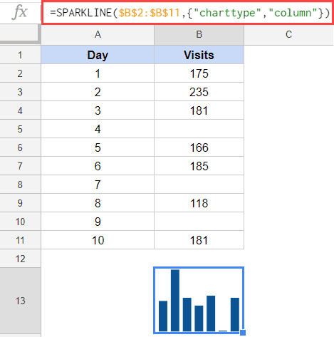
- It’s in the [option] argument where you specify what type of chart you need. For example, if I want a bar chart, my formula becomes: =SPARKLINE($B$2:$B$11,{“charttype”,“column”})
- Note that within the curly bracket, I have “charttype”,“column”. The first part tells the Sparkline function that I am specifying the chart type, and the second part then specifies the chart type.
- After the chart type has been specified, there are many options within each chart type. For example, if I want the specify the line width of the line chart or the color of the line chart, I can do that. The formula in that case would look like this – =SPARKLINE($B$2:$B$11,{“charttype”,“line”;“linewidth”,2})
- All options occur in pairs (such as “charttype”,“column”), where the first one is the type and the second one is the value of it. In the formula in previous step, there are two pairs {“charttype”,“line”;“linewidth”,2}
- All pairs of options and value are separated by semicolons.
- Numbers and TRUE/FALSE argDetermines’t need to be enclosed in double quotes.
Now don’t get overwhelmed by all these bullet points above.
It becomes quite easy to follow when you go through the examples below.
Now let’s go through each of the Sparkline types and the options available in each.
Line Sparkline
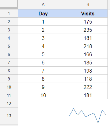
Below is an example of a line sparkline in Google Sheets:
The below formula created this:
=SPARKLINE($B$2:$B$11)
Since Line chart is the default chart type, I only had to specify the range.
The following formula would do the same:
=SPARKLINE($B$2:$B$11,{"charttype","line"})
Now let’s have a look at the options that are available in the Line chart type.
| Option | What it Does |
| “linewidth” |
Determines how thick the line will be in the chart. A higher number means a thicker line.
|
| “color” | Sets the color of the line. |
| “empty” |
Sets how to treat empty cells. Possible corresponding values include: “zero” or “ignore”.
|
| “nan” |
Sets how to treat cells with non-numeric data. Options are: “convert”and “ignore”.
|
| “rtl” |
Determines whether or not the chart is rendered right to left. Options are true or false.
|
| “xmin” | Sets the minimum value along the horizontal axis. |
| “xmax” | Sets the maximum value along the horizontal axis. |
| “ymin” | Sets the minimum value along the vertical axis. |
| “ymax” | Sets the maximum value along the vertical axis. |
Linewidth Option
This option allows you to give a thickness to the line.
For example, the below formula would make the line of the line chart thicker than regular.
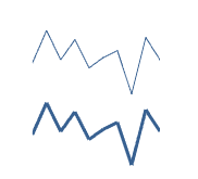
=SPARKLINE($B$2:$B$11,{"charttype","line";"linewidth",2})
In the above image, the top one is regular line sparkline and in the bottom one, the line width has been specified as 2.
Color Option
In this option, you can specify the color you want for the line sparkline.
The below formula would make the color red:
=SPARKLINE($B$2:$B$11,{"charttype","line";"color","red"})
You can also use the hex code of the color in this (remember to keep it enclosed in double quotes).
Note: While this option is available, a better way to change the color of the sparkline chart is to simply change the font color of the cell.
Empty Option
In this option, you tell the Sparkline formula how to handle data gaps.
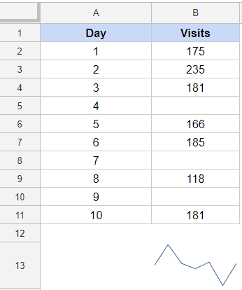
Suppose I have the data set as shown below:
If I create a line sparkline using this data, I get the following result:
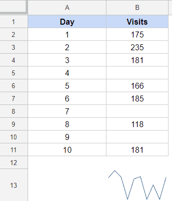
By default, the line chart type would ignore the data gaps. So it simply plots the line as if those cells with data gaps don’t exist.
You can choose to plot these gaps as 0. The following formula would do that:
=SPARKLINE($B$2:$B$11,{"charttype","line";"empty","zero"})
This will give you can sparkline as shown below:
NaN Option
If you have a dataset where you have text values along with numerical data, you can use this option to specify whether you want to ignore these values or convert these to 0.
By default (if you don’t specify anything), the Sparkline formula would ignore these text values.
In case you want these to be converted to 0, you can use the below formula:
=SPARKLINE($B$2:$B$11,{"charttype","line";"nan","convert"})
RTL Option
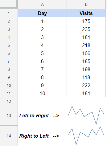
This option allows you to render the chart right to left or left to right.
The values, in this option, are TRUE – which is for right-to-left and FALSE which is for left-to-right.
If you don’t specify anything, the chart is rendered left to right.
Below is the formula that will render it right to left:
=SPARKLINE($B$2:$B$11,{"charttype","line";"rtl",TRUE})
This option can be useful when you have the data in reverse order, and you want to create a chart without changing the original data set.
XMAX and XMIN Options
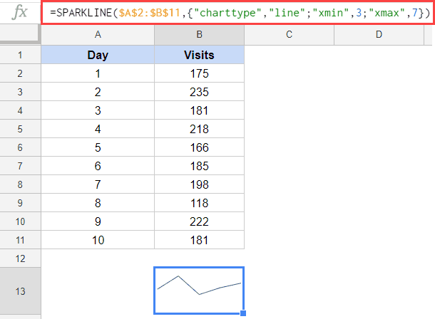
These options allow you to restrict the x-axis of the line chart.
For example, in the website traffic data, if you want to start from day 3 onwards, you can specify xmin as 3.
Or you want to plot data between 3rd and 7th day only, you can specify xmin as 3 and xmax as 7.
Below is the formula that will plot data between 3rd and 7th day only.
=SPARKLINE($A$2:$B$11,{"charttype","line";"xmin",3;"xmax",7})
Note that in the above example, the range used is $A$2:$B$11.
Only when it has the first column with x-axis values can this formula pick a minimum and aa maximum value from it.
YMAX and YMIN Options
Just like xmin and xmax, where you could restrict the x-axis values, with ymax and ymin, you can restrict the Y-axis of the line chart.
For example, if I only want to see on what days the traffic was above 200, I can do that by using the below formula:
=SPARKLINE($A$2:$B$11,{"charttype","line";"ymin",200})
Column Sparkline
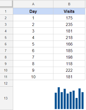
Below is an example of a column sparkline in Google Sheets:
The below formula created this column sparkline chart:
=SPARKLINE($B$2:$B$11,{"charttype","column"})
Now let’s have a look at the options that are available in the Column chart type.
| Option | What it Does |
| “color” | Sets the color of chart columns. |
| “lowcolor” | Sets the color for the lowest value in the chart |
| “highcolor” | Sets the color for the highest value in the chart |
| “firstcolor” | Sets the color of the first column |
| “lastcolor” | Sets the color of the last column |
| “negcolor” | Sets the color of all negative columns |
| “empty” |
Sets how to treat empty cells. Possible corresponding values include: “zero” or “ignore”.
|
| “nan” |
Sets how to treat cells with non-numeric data. Options are: “convert”and “ignore”.
|
| “axis” | Decides if an axis needs to be drawn (true/false) |
| “axiscolor” | Sets the color of the axis (if applicable) |
| “ymin” |
Sets the custom minimum data value that should be used for scaling the height of columns (not applicable for win/loss)
|
| “ymax” |
Sets the custom maximum data value that should be used for scaling the height of columns (not applicable for win/loss)
|
| “rtl” |
Determines whether or not the chart is rendered right to left. Options are true or false.
|
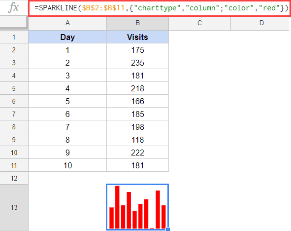
Color Option
This allows you to color the sparkline column bars in the specified color.
The below formula would color the bars red:
=SPARKLINE($B$2:$B$11,{"charttype","column";"color","red"})
While you can do this using the formula, the easiest way to do this is by simply changing the font color of the cell (unless you’re creating interactive sparkline charts where the color value is based on user selection or formula output).
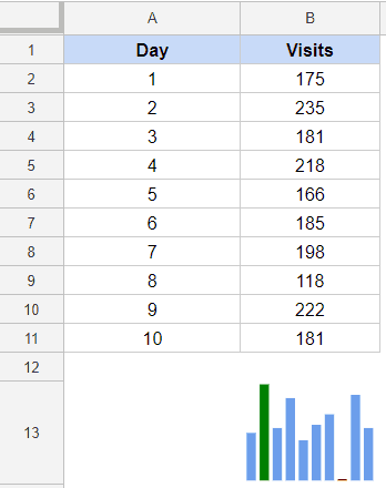
LowColor and HighColor Options
Using these options, you can highlight the lowest and the highest point in the chart in a different color. These are useful as it allows you to highlight specific data points and making it easy to spot these high/low points.
The below formula highlights the highest bar in green and lowest in red.
=SPARKLINE($B$2:$B$11,{"charttype","column";"lowcolor","red";"highcolor","green"})
FirstColor and LastColor Options
Using these options, you can highlight the first and/or the last point in the column chart with a different color.
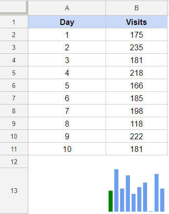
The below formula would highlight the first column of the chart with green color.
=SPARKLINE($B$2:$B$11,{"charttype","column";"firstcolor","green"})
NegColor Option
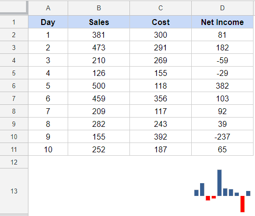
In case you have negative values that you need to plot in the sparkline, you can use this option to specify the color in which you want to highlight these negative values.
The below formula would highlight the negative values in red in the given dataset (see image below):
=SPARKLINE($D$2:$D$11,{"charttype","column";"negcolor","red"})
Axis and AxisColor Options
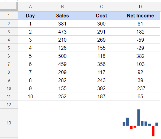
In the above example (where negative value bars are highlighted in red), you can see that there is an invisible axis. Above the axis are positive values and below the axis are negative values.
You can make an axis appear by using the axis option. When you set it to yes, you can see the axis.
The following formula would do this:
=SPARKLINE($D$2:$D$11,{"charttype","column";"negcolor","red";"axis",TRUE})
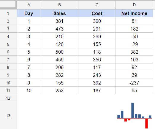
You can also specify the color of the axis if you want.
The following formula would color the horizontal axis red:
=SPARKLINE($D$2:$D$11,{"charttype","column";"negcolor","red";"axis",TRUE;"axiscolor","red"})
Empty Option
In this option, you tell the Sparkline formula how to handle data gaps.
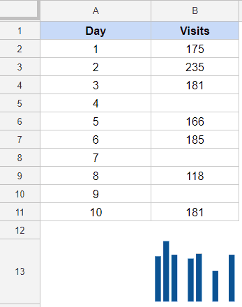
Suppose I have the data set as shown below:
If I create a column sparkline using this data, I get the following result:
By default, the column chart type would ignore the data gaps. So it simply plots the column chart as if those cells with data gaps don’t exist.
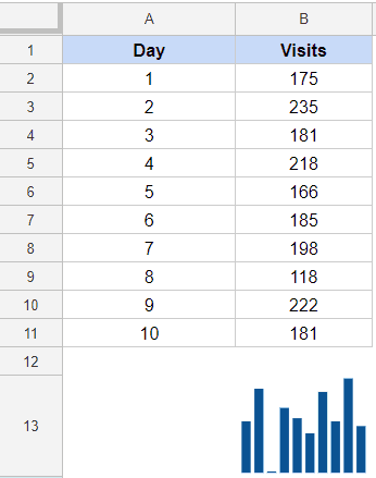
You can choose to plot these gaps as 0. The following formula would do that:
=SPARKLINE($B$2:$B$11,{"charttype","column";"empty","zero"})
This will give you can sparkline as shown below:
NaN Option
If you have a dataset where you have text values along with numerical data, you can use this option to specify whether you want to ignore these values or convert these to 0.
By default (if you don’t specify anything), the Sparkline formula would ignore these text values.
In case you want these to be converted to 0, you can use the below formula:
=SPARKLINE($B$2:$B$11,{"charttype","column";"nan","convert"})
RTL Option
This option allows you to render the chart right to left or left to right.
The values, in this option, are TRUE – which is for right-to-left and FALSE which is for left-to-right.
If you don’t specify anything, the chart is rendered left to right.
Below is the formula that will render it right to left:
=SPARKLINE($B$2:$B$11,{"charttype","column";"rtl",TRUE})
This option can be useful when you have the data in reverse order, and you want to create a chart without changing the original data set.
YMIN and YMAX Options
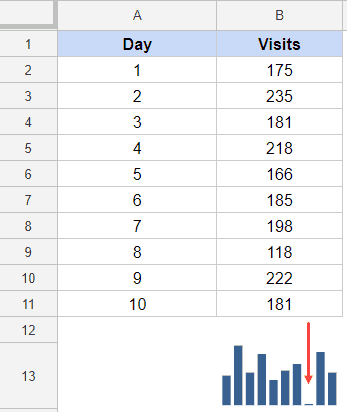
In all the column charts covered above, you would notice that lowest value bar is hardly visible.
But if you look at its value, it’s 118.
This can be misleading as visually the value looks close to 0.
This happens as the sparkline column chart automatically adjusts the yaxis based on the data.
You can control the Y-axis using the ymin and ymax option.
For example, the below formula will make the Y-axis start at 0 (which will also make out lowest data point more visible).
=SPARKLINE($B$2:$B$11,{"charttype","column";"ymin",0})
The above chart is a better representation of the data as you can now correctly see the magnitude as well as the variation in the data points. As a charting best practice, it’s always better to have the axis start at 0.
Bar Sparkline
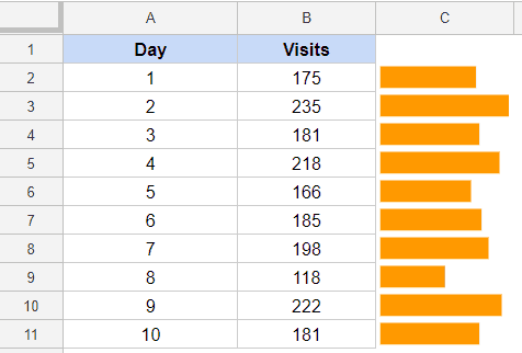
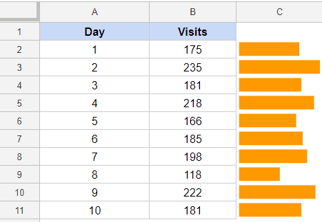
Below is an example of a bar sparkline in Google Sheets:
Note that unlike line and column sparklines, a bar sparkline chart doesn’t take a lot of values per chart.
In cell C2, it takes only one value (175) to create the bar chart.
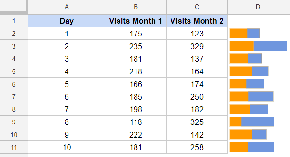
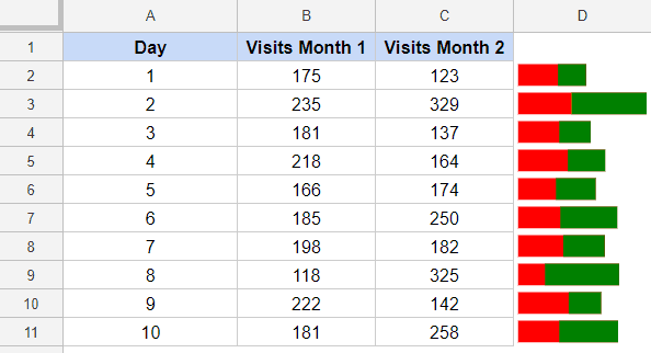
In Google Sheets, the bar sparkline chart is designed to be used efficiently with a maximum of 3 values, so you can get a stacked bar chart in each cell. While you can use it with more than 3, there is no way to have different colors for each data set.
Here is an example where two bars are created in the same sparkline chart:
Now let’s have a look at the options that are available in the Column chart type.
| Option | What it Does |
| “max” | Sets the maximum value along the horizontal axis. |
| “color1” | Sets the first color used for bars in the chart. |
| “color2” | Sets the second color used for bars in the chart. |
| “empty” |
Sets how to treat empty cells. Possible corresponding values include: “zero” or “ignore”.
|
| “nan” |
Sets how to treat cells with non-numeric data. Options are: “convert”and “ignore”.
|
| “rtl” |
Determines whether or not the chart is rendered right to left. Options are true or false.
|
Max Option
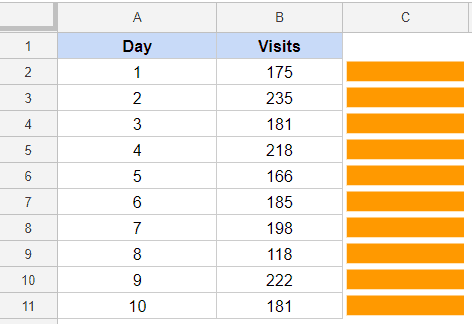
When you create a bar chart, since each cell only knows the value of bar it needs to create, there is no way to know how long the bar can be.
For example, if I have the data set (as shown below), and I use the following formula, I will get same size bars in each cell.
=SPARKLINE(B2,{“charttype”,“bar”})
All the bars are of the same length as the formula has no way to know the value as compared to the other values.
Hence, to make sure we get a comparative view, we need to use the Max option.
In case of max, you can either manually enter the value, or you can use the largest value in the list to get the maximum.
The below formula will give you largest value from the list as the maximum value and all the other bars are adjusted relative to it.
=SPARKLINE(B2,{“charttype”,“bar”;“max”,MAX($B$2:$B$11)})
In case you want to create bar sparklines for two data sets, you can use the formula below:
=ArrayFormula(SPARKLINE(B2:C2,{"charttype","bar";"max",MAX($B$2:$B$11+$C$2:$C$11)}))
I have used the MAX function as a value of the max option – MAX($B$2:$B$11+$C$2:$C$11).
This formula gives the maximum value of the sum of column B and C. Since this is an array function, I had to wrap it in ArrayFormula in Google Sheets.
Color1 and Color2 Options
You can specify the color you want for the bars (in case you have the stacked bar chart).
In case you only have one single value bar, the better way is to simply change the font color.
The below formula gives a red color to the first part of the bar and green to the second part.
=ArrayFormula(SPARKLINE(B2:C2,{"charttype","bar";"max",MAX($B$2:$B$11+$C$2:$C$11);"color1","red";"color2","green"}))
Empty Option
In this option, you tell the Sparkline formula how to handle data gaps.
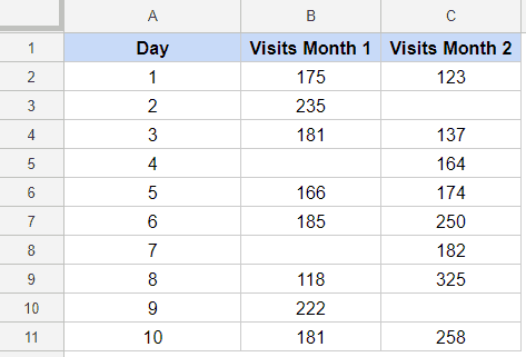
Suppose I have the data set as shown below:
I can create bar sparklines and specify what I want to do with the empty cells. I can ignore these or make them be considered a 0.
Now all these options will give different result.
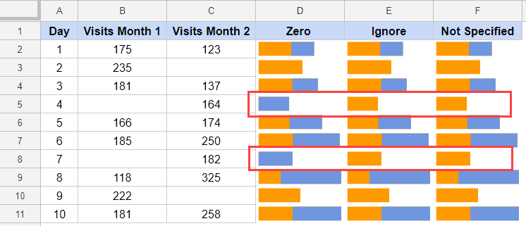
Below I have created bar sparklines using the data set, and there are three scenarios:
- When Empty option has the value “Zero”
- When Empty option has the value “Ignore”
- When Empty option is not used.
The following three formulas are used for each (in the same order):
=ArrayFormula(SPARKLINE(B2:C2,{"charttype","bar";"max",MAX(B2:B11+C2:C11);"empty","zero"}))
=ArrayFormula(SPARKLINE(B2:C2,{"charttype","bar";"max",MAX(B2:B11+C2:C11);"empty","ignore"}))
=ArrayFormula(SPARKLINE(B2:C2,{"charttype","bar";"max",MAX(B2:B11+C2:C11)}))
Here are the result:
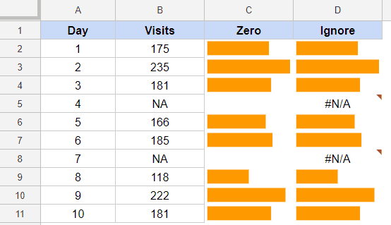
Note that while the results are different (as highlighted).
If you make the empty cell be considered as 0, the next color is plotted, but in other cases, it is completely ignored.
NaN Option
If you have a dataset where you have text values along with numerical data, you can use this option to specify whether you want to ignore these values or convert these to 0.
If you don’t specify anything or use the Ignore option, the Sparkline formula would return an error.
In case you want these to be converted to 0, you can use the below formula:
=SPARKLINE($B$2:$B$11,{"charttype","column";"nan","convert"})
Below is a comparison where I have shown the result in both the cases (when NaN value is “zero” and “ignore”).
RTL Option
This option allows you to render the chart right to left or left to right.
The values, in this option, are TRUE – which is for right-to-left and FALSE which is for left-to-right.
If you don’t specify anything, the chart is rendered left to right.
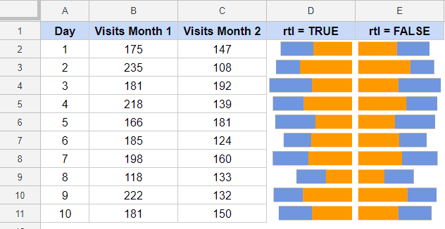
This option is useful in bar sparklines only when you are plotting multiple columns.
Below is the formula that will render it right to left:
=SPARKLINE($B$2:$B$11,{"charttype","column";"rtl",TRUE})
Below is an example where I have shown a comparison of using TRUE and FALSE as values of “rtl”.
Win-Loss Sparkline Charts
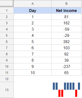
Win-Loss sparkline charts are just like column charts, with one exception – these don’t show the magnitude.
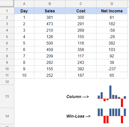
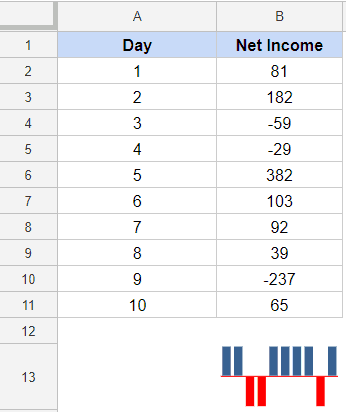
In the below example, I’ve plotted net income values. You can see the difference in a column sparkline and a win-loss sparkline.
With a win-loss sparkline, I can only decipher if it was a positive or negative. But with column chart, you can also see the magnitude.
Win-loss sparklines can be used if the data is binary (coin toss head/tails or yes/no).
The options and values for win-loss sparkline charts are exactly the same as that of column sparklines.
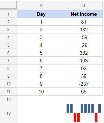
Color Option
This allows you color the column bars in the specified color.
The below formula would color the bars red:
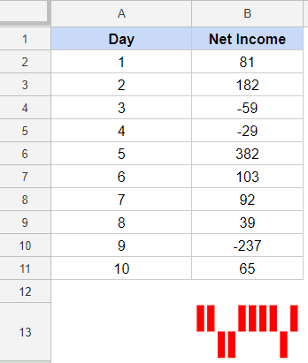
=SPARKLINE($B$2:$B$11,{"charttype","winloss";"color","red"})
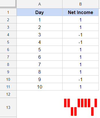
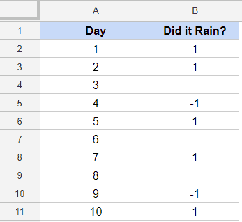
While I have used the Net Income numbers, if I replace each positive number with 1 and each negative number with -1, the result chart would exactly be the same.
While you can do this using the formula, the easiest way to do this is by simply changing the font color of the cell (unless you’re creating interactive sparkline charts where the color value is based on user selection or formula output).
LowColor and HighColor Options
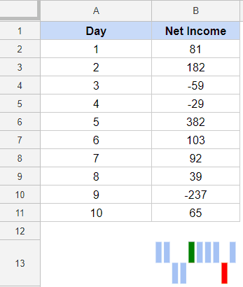
While the Win-Loss sparkline charts don’t show the magnitude of the value, you can still highlight the maximum and minimum values in a different color.
The below formula highlights the highest bar in green and lowest in red.
=SPARKLINE($B$2:$B$11,{"charttype","winloss";"lowcolor","red";"highcolor","green"})
FirstColor and LastColor Options
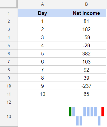
Using these options, you can highlight the first and/or the last point in the win-loss chart with a different color.
The below formula would highlight the first bar of the chart with green color and the last bar in red color.
=SPARKLINE($B$2:$B$11,{"charttype","winloss";"firstcolor","green";"lastcolor","red"})
NegColor Option
You can use the “negcolor” option to specify the color in which you want to highlight the negative values.
The below formula would highlight the negative values in red in the given dataset (see image below):
=SPARKLINE($D$2:$D$11,{"charttype","column";"negcolor","red"})
Axis and AxisColor Options
In the above example (where negative value bars are highlighted in red), you can see that there is an invisible axis. Above the axis are positive values and below the axis are negative values.
You can make an axis appear by using the axis option. When you set it to yes, you can see the axis.
The following formula would do this:
=SPARKLINE($D$2:$D$11,{"charttype","winloss";"negcolor","red";"axis",TRUE})
You can also specify the color of the axis if you want.
The following formula would color the horizontal axis red:
=SPARKLINE($D$2:$D$11,{"charttype","column";"negcolor","red";"axis",TRUE;"axiscolor","red"})
Empty Option
In this option, you tell the Sparkline formula how to handle data gaps when creating win-loss sparklines.
Suppose I have the data set as shown below:
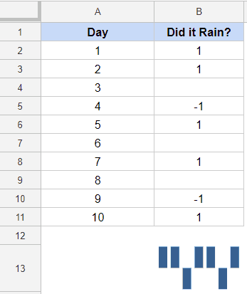
I can use the below formula to create a win-loss sparkline chart, and it will simply ignore the blank cells and plot the rest as a continuou chart.
=SPARKLINE($B$2:$B$11,{"charttype","winloss"})
By default, the column chart type would ignore the data gaps. So it simply plots the column chart as if those cells with data gaps don’t exist.
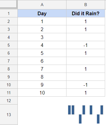
You can choose to plot these gaps as 0. The following formula would do that:
=SPARKLINE($B$2:$B$11,{"charttype","winloss";"empty","zero"})
This will give you can sparkline as shown below:
NaN Option
If you have a dataset where you have text values along with numerical data, you can use this option to specify whether you want to ignore these values or convert these to 0.
By default (if you don’t specify anything), the Sparkline formula would ignore these text values.
In case you want these to be converted to 0, you can use the below formula:
=SPARKLINE($B$2:$B$11,{"charttype","column";"nan","convert"})
RTL Option
This option allows you to render the chart right to left or left to right.
The values, in this option, are TRUE – which is for right-to-left and FALSE which is for left-to-right.
If you don’t specify anything, the chart is rendered left to right.
Below is the formula that will render it right to left:
=SPARKLINE($B$2:$B$11,{“charttype”,“column”;“rtl”,TRUE})
Want to become a Google Sheets expert? We highly recommend checking out Udemy’s Google Sheets Comprehensive Masterclass and the Complete Google Sheets Course.
You May Also Like the Following Google Sheets Tutorials Useful:
- Conditional Formatting Based on Another Cell Value in Google Sheets.
- Creating a Heat Map in Google Sheets (Step-by-Step Tutorial).
- How to Color Alternate Rows in Google Sheets.
- Using Query Function in Google Sheets.
- How to Make a Pie Chart in Google Sheets
- Excel Vs Google Sheets



Thank you so much for the excellent tutorial and example. This is very helpful!