How to Make a Pie Chart in Google Sheets – Step-by-Step Video Tutorial:
How to make a pie chart in Google Sheets? Pie charts are a great way to visually represent data because they are easy to create and analyze.
You can create your own pie chart on Google Sheets very easily. Google Sheets also provides you with different editing features to customize your pie chart to whatever suits your needs.
Let’s take a look at how to make a pie chart in Google Sheets.
This Article Covers:
How To Make a Pie Chart in Google Sheets in 2026?
We will look at the step-by-step directions for how to make a pie chart in Google Sheets. Then we’ll look at some additional steps you can take to add some customization to your charts.
Remember that a pie chart compares things within the same larger category. In this example, we will make a mock budget and compare the costs.
Our pie chart will show what chunk of our monthly budget goes to different categories, such as food costs, rent, and student loan payments.
Below is the dataset that we will be using to create a pie chart:

You’ll notice this is a two-column pie chart, and your data might look similar, but it can be done with any data in the cells.
Here’s our guide on how to make a pie chart in Google Sheets:
- Go to the Google Sheets that has the data
- Select the cells for which you want to create the pie chart

- With the data selected, navigate to the top bar, and click on the “Insert” option in the menu

- Click on the “Chart” option
- Note: Do not click an empty cell because it will un-select the data you want to make a chart of

The above steps would make Google Sheets use some assumptions and try to guess what type of chart you want to insert.
In this case, we got lucky, and we knew we wanted a pie chart. You’ll notice that our data is still selected, and now there’s a big pie chart next to it.

The above picture was taken right after I left-clicked “Chart” with my data highlighted. In other words, this is the default chart that was generated.
We can see that each category is a different color, a leader is pointing to them with a label, and the chart is titled “Amount.”
But what happens if it doesn’t guess correctly or you need to change the chart type? You have a few options.
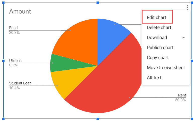
Left-clicking the chart will highlight the whole chart area in blue, and you’ll see the Ellipsis button (three dots) on the top right corner of the chart. When you click the Ellipsis, you’ll get several options.

Now you’ll see you can edit the chart. Clicking on the “Edit Chart” option will open the “Chart editor” pane on the right.

If you haven’t got the pie chart as your default chart, you can change it by clicking on the “Chart Type” option (in the “Setup” tab). As you scroll down, you’ll pass options like Line, Area, Column, Bar, and Pie.
Clicking on “Pie Chart” will convert your chart to a pie chart if it isn’t already.

Once you have inserted the default pie graph, you can edit and customize it to suit your needs.
Editing the Pie Chart
Now you know how to make a pie chart in Google Sheets, but what if the automatically generated pie chart isn’t exactly what you’re looking for?
Good news. You can customize and edit a ton of options on your chart. Let’s take a look at what we can do.
The way to start customizing is to left-click your chart, click the Ellipsis button (three dots) that appears in the top right of the chart, and click “Edit chart.”

That will open the “Chart editor” window with a range of options, like this:

Changing the Data Range
If you messed up when you first made the pie chart, and you picked the wrong cells, that’s not a problem.
Simply click the box to the right of “Data Range,” and it will open this box:

You can now choose a new range by either holding a left click and highlighting the cells in the workbook, or you can manually type it in the box. This will automatically change your pie chart.
Change the Label on Your Pie Chart
Now you know how to make a pie chart on Google Sheets. You’ll also notice the option to change the label as well in this same menu.

In our example, it doesn’t make sense to change the label, as there are only two columns, where one column has cost values that are plotted as pie slices.
But if you need to change the labels (and maybe use some other labels in a different data range), you can do that from here.
How To Make a Pie Chart in Google Sheets Look Better
The final piece of customization you should look at is the ability to change the aesthetics of your pie chart.
What does this mean?
Well, you can change the colors, make it 3D, add a legend, change around the titles and labels, and add a donut hole.
This is found under the same side panel menu we looked at before, but now we will click “Customize.”

Changing Chart Style of Pie Chart
After clicking the “Chart style” option, the arrow will open the category to show us some options we can change.

You can change the following things in the chart using these options:
- The background color of the pie chart
- The border color of the chart. In case you don’t need a border for the chart, you can remove it by setting the chart border color to ‘none’
- Change the font style of the text.
How To Make a 3D Pie Chart in Google Sheets
To make a 3D pie chart:
- Select your data range
- Go to “Insert” > “Chart“
- In the “Chart editor,” go to “Setup” and click on the drop-down for “Chart type“

- Scroll to “Pie” charts and choose the 3D pie chart

This will create a 3D pie chart based on the data you selected.
There is also an option to convert the normal chart into a 3-D pie chart. Here’s how:
- Open the “Chart editor” by going to the menu and selecting “Edit.” You can also do this by double-clicking on your pie chart.
- Go to “Customize” > “Chart Style“

- Check on the box for “3D”

Your pie chart will become 3D. However, remember that a 3-D pie chart is often misleading and hard to read.

Customizing the Pie Chart Option
The next option in our customization menu is “Pie Chart.” Clicking it will drop-down a list of options.

Here again, you will find some interesting options;
- Donut hole: This is where you can convert this pie chart into a donut chart. Just specify the value of the donut hole, which will add a hole with that much space taken off from the center of the pie chart.
- You can also change the border color of each slice using the “Border color” option
- Then, there is an option to add a “label to each slice“
How Do I Add Percentages to a Pie Chart in Google Sheets?
When you create your pie chart in Google Sheets, you’ll notice that it automatically comes with percentages. However, in case this doesn’t happen, here’s how you can make a pie chart with percentages in Google Sheets:
- Open the “Chart editor” by double-clicking on the pie chart
- Go to “Customize“ > “Pie chart“

- Go to the “Slice Label” drop-down
- Choose “Percentage“

The percentage for each slice will appear in the pie chart.

Changing Pie Slice on Pie Chart
With the pie chart, you can also make one of the slices stand out by protruding slightly outside the pie graph.
As shown in the image below, I have made the car slice a bit more prominent by making it stand out (literally) from the rest of the pie chart.

This can be done from the “Pie slice” settings in the “Chart editor.”
Here is how to do this:
- Click on the “Customize” tab in the “Chart editor“
- Click on the “Pie slice” option. This will make it expand and show more options
- Click on the drop-down and select the category that you want to highlight
- Optional: Change the color of the pie. You can use this option to make the color bright and something that stands out.
- Select the “distance” from the center option. Apart from selecting from the pre-existing options, you can also manually enter the value (for example, 10%).
Exporting a Pie Chart

To export your chart:
- Click on the 3 dots menu on the chart
- Click “Download“
- Select the file type you wish to download the chart as
How Do You Make a Double Pie Chart in Google Sheets?

There isn’t a native double pie chart in Google Sheets. However, you can make a smaller donut chart fit inside a larger one for a similar effect. Here’s how to make a double pie graph in Google Sheets:
- Navigate to “Insert” > “Chart” > “Chart type” > “Doughnut chart“
- Click on the “Customise” tab
- In the “Chart style” > “Background color menu,” select “None“
- In “Pie chart” > select “Doughnut hole 75%“
- Repeat for the second donut chart but make the hole 25% instead
- Adjust the sizes of the charts and place them together
How To Make a Pie Chart in Google Sheets on iPhone and Android?
You can also make pie charts using Google Sheets mobile apps. Here’s how to make a pie chart on Google Sheets for mobile:
- Highlight the cells for your chart
- Tap “Insert” > “Chart“
- Tap “Type“
- Tap “Pie chart“
- Tap “Done“
Frequently Asked Questions
How To Make a Pie Chart in Google Sheets?
Making a pie chart in Google Sheets is pretty easy:
- Select your data range
- Go to “Insert” > “Chart“
- Select “Pie chart“
How Do I Show Percentages in a Pie Chart in Google Sheets?
To show percentages in a pie chart in Google Sheets:
- Open the “Chart editor” by double-clicking on the pie chart
- Go to “Customize” > “Pie chart“
- Go to the “Label” drop-down
- Choose “Percentage“
How To Make a Pie Chart in Google Sheets with Multiple Columns?
To make a pie chart in Google Sheets with multiple columns, all you need to do is select the range of data you want to use. Note: You can only represent one column of data at a time in a pie chart.
An option you have is making two donut pie charts for each column and combining them by putting the smaller one in the larger donut.
- Make two donut pie charts for each data
- Go to “Chart editor” > “Customize“
- Go to “Chart style” > “Background color” and choose “None.” Do the same for the second pie chart.
- Choose the pie chart you want to be outside and change its donut hole to 75% in “Customize” > “Pie chart“
- Resize the inner pie chart and position it in the middle of the larger one

Conclusion
Now you know how to make a pie chart in Google Sheets. The actual creation of how to make a pie chart in Google Sheets requires just a few steps that we looked at earlier. The customization options are a lot more interesting, and we covered some of the more relevant options you have.
If you’d like to master how to make a pie chart in Google Sheets and other functions, consider checking out our comprehensive course. When it comes to showing data, a pie chart is a great option.
Yet, there’s still plenty more to learn. Check out our other charting guides, such as:
- How To Create a Combo Chart in Google Sheets
- How To Create a Funnel Chart in Google Sheets [Step-by-Step]
- Easy Step-By-Step Radar Chart Google Sheets Guide
- The Pareto Chart Google Sheets Guide: 3 Easy Steps
- Creating Candlestick Chart in Google Sheets (Step-by-step)
- Easy Bubble Chart Google Sheets Guide (Free Template)