Watch – Radar Chart Google Sheets Video Tutorial
Google Sheets radar charts are an effective tool for visualizing data sets to compare and contrast. A radar chart will provide the end-user with a quick, clear picture of the top KPIs.
This Article Covers:
Why Use a Google Sheets Radar Chart?
As the business world continues to evolve and develop, one thing is clear. During the information age, data must be at the center of all business decisions.
This theory spills over to the personal world as well. Educated decision-makers make the best decisions. Having data is great! It is the first step, but it is not the only step, and it is not the most critical step. Once the data is compiled, users must begin to organize and visualize the data.
Without adequate visualization, one cannot make data-driven decisions and will regularly make uninformed decisions that can be detrimental to the goal. Google Sheets charts are one of the most effective ways of visualizing data.
Creating a radar chart with Google Sheets is easy, effective, and attractive. They’re good for displaying statistics on many different variables at the same time. For instance, they could be used to compare:
- Cars – where the different axes could show top speed, price, mileage etc.
- Gymnasts scores in different events
- Comparing medical survey results
There are numerous Google add-ons for charts, including radar charts. However, most of these cost money and are a bit more complicated. If you create and use charts regularly, I would recommend exploring Google’s add-ons. Otherwise, the Google Sheets radar chart is straightforward and easily customized into attractive charts that improve any presentation.
What is a Google Sheets Radar Chart?
A radar chart, also known as a spider chart, is a visual representation of data points and how they correspond. They are very effective comparison tools.

A radar chart comes in handy when:
- Comparing two tech models (i.e., computers or monitors).
- Looking at your budget compared to spending.
- Reviewing CPC marketing results.
- Comparing student grades.
- Comparing personality survey responses.
- More
Limitations of a Google Sheets Radar Chart
Radar charts are brilliant tools for various comparisons. However, consider these limitations when choosing a chart.
- It should be limited to 3 data sets, once it gets more than 3 data sets, it can become cluttered, and radar charts suffer when they become too messy.
- You should have no more than 12 factors in one chart. Each additional element will create more clutter and make the indications less prominent.
Types of Radar Charts in Google Sheets
There are two types of Google Sheets radar charts. There are Single Axis and Dual Axis radar charts.
Single Axis
This form of a radar chart is very effective in viewing a PPC ad campaign for specific and determined data. For example, we could compare this month and last month to break down the daily cost by day of the week. So the radar will show us the price of our ad campaign for each day (Monday, Tuesday, etc.) for both this month and last month, allowing us to find any relevant patterns and isolate the days on which we spend the most.
Dual Axis
On the other hand, if we wanted to isolate the overall CPC of the ad campaign, we could use a Dual Axis Radar Chart in Google Sheets, which allows us to view the CPC and Click data for each day of the week. Now we will be able to compare the two as they are over each other. We can use this to discover which days correlate as the most effective days to increase ad spend.
Radar Chart Google Sheets Template
Feeling lazy? You can use this template and change the data to suit your needs. Just make a copy of the file first.
How to Make a Radar Chart in Google Sheets
Step 1 – Decide what data set will be used to create the chart and select the data needed by clicking and dragging over the required data. Often data is in a table like pictured, but a large, growing dataset will work as well.
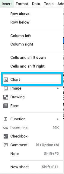
Step 2 – Click the Chart button in the top right of the toolbar. OR, in the menu, select the Insert tab; you will see a chart option, choose that.
Step 3 – In Chart Type, Select “Radar Chart.”
About the Radar Chart
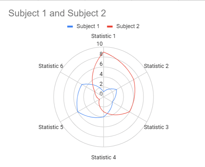
As you look at the radar chart, you will immediately notice that it is different from the “common” charts used. It vaguely resembles a radar screen or a spider web. It is critical that you first know the chart elements before you begin editing and customizing them.

The radar chart consists of the following elements (moving top to bottom):
- Title
- Legend
- Vertical Axis
- Data Series
- Horizontal Axis
- Axis Title
How to Edit your Radar Chart
Below you will find the steps to edit your new radar chart.
- Select the chart.
- Click the three dots in the top right corner of the chart.
- Select Edit Chart
The remaining steps will depend on the section you are hoping to edit.
How to Edit the Data in a Radar Chart
When you open the Chart Editor, you will see it appear on the right side of the screen. At the top of the editor, if it is not already selected, select Setup. Here you can change the data and the way it communicates with the radar Chart.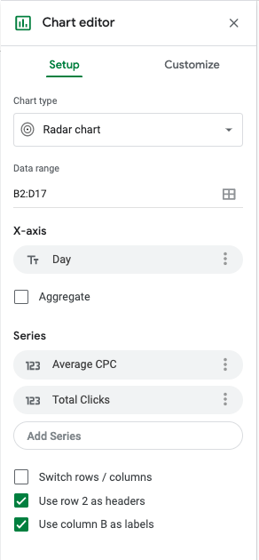
Data Range
- The range used for the data.
- Automatically selected when you selected the data table cells at the start of this process.
- You can use the grid button to the right of the current range to choose a different range/s.
X-axis
- The horizontal axis selector.
- The horizontal axis is automatically set based on the data.
- If it is incorrect or if the data changes, it can be updated here.
- To edit the range, click the name of the X-Axis, and it will bring up the options box to select another range.
- The Label is set based on the column label in the data table. You will need to change the column label in the data table or change it in the customize section.
Aggregate Check Box
- This checkbox will allow you to select and aggregate data options for the data series.
- For this example, you will need to have the aggregate checked. This is because, in the data, you will notice it is two weeks of data, so there are multiples of each weekday listed. This aggregates based on the day.
Series
- Where you view and edit your data series.
- The Label is set based on the column label in the data table. You will need to change the column label in the data table or change it in the customize section.
- To edit the range, click the name of the series, and it will bring up the options box to select another range.
- You can also add new series here. These series must be the same size range, but they do not have to be consecutive. For example: currently, the series is in Columns B4:B17, C4:C17, and D4:D17. You could also have a series in column H4:H15.
Checkboxes
- Switch rows/columns: This swaps the rows and columns if the table is opposite this one.
- Use row * as headers: uses whichever row is in the table headers position.
How to Edit the Appearance of a Radar Chart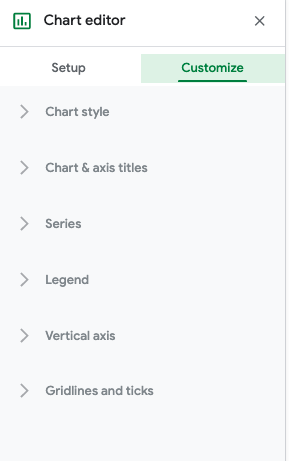
When you open the Chart Editor, you will see it appear on the right side of the screen. At the top of the editor, select Customize. Here you can customize the chart’s appearance, which allows you to brand it with company colors or stick to an existing color scheme.
Chart style
- Here you can edit the overall chart elements.
- You can change the background, font, and border.
- Checkboxes:
- Smooth: removes jagged edges from the line chart
- Maximize: removes blank border space and enlarges to max amount.
Chart & axis titles
- In this section, you will see a drop-down that lets you select which chart title you would like to edit.
- You can edit the Chart Title, Chart Subtitle, Horizontal Axis Title, and Vertical Axis Title.
- You can edit the text, font, location, color, and size.
Series
- Series enables you to edit the radar charts visualization.
- This section will see a drop-down that lets you select which series you would like to edit.
- You can now edit the color, opacity, dash type, line thickness, point size, and point type.
Legend
- You can change the position, font, and color of the legend.
Vertical Axis
- You can change the min/max value, scale format, and number format.
Gridlines and ticks
- You can change the gridlines and ticks for both the vertical and horizontal axis.
- The vertical axis has many more options in this example. You can change the spacing, count, color, and select various ticks and gridlines.
- The horizontal axis has only one choice in this example and provides ticks along the axis.
Google Sheet Radar Chart Add-ons
Many people will find Google Sheet Add-ons such as ChartExpo that will help build charts. These charts are visually more appealing and technically more complex, which is excellent, but most of the add-ons that work for a Radar Chart are fee-based add-ons. If you do not already use these fee-based services, they may be worth considering if you need to make a lot of radar charts in your work.
Google Radar Chart FAQ
What is a Radar Chart in Google Sheets? / What is a Spider Chart in Google Sheets?
A radar chart is sometimes also known as a spider chart. They are the same thing. These charts are great for comparing multiple related data points to see where statistics are excelling our doing poorly at a glance. They radiate out from the center point and look like a spider web. Hence both the names.
How Do I Create a Radar Chart in Google Sheets?
- Highlight the data you want to display in the radar chart
- Click the chart button in the toolbar
- In the chart selection menu, click the radar chart image
How Do You Label a Radar Chart?
Each branch in a radar chart should be labeled with the variable it represents. If there are multiple axis, they should be colored differently and labeled with what they represent, like below.
Conclusion
A radar chart can be a powerful tool when used within its appropriate scope. It will create a fast and easy-to-digest visual aid to build your presentation or reporting system. They are simple to make, and once completed, they are easy to customize and develop to your specific needs and requirements.
If you found this radar chart Google Sheets guide useful and want to learn how to make other kinds of charts in Google Sheets, Check out some of these tutorials: