
Bubble Charts are a special type of chart that’s generally used to display multiple dimensions of data.
In Google Sheets and Microsoft Excel, there’s a special “Chart” function that includes Bubble Charts. It’s not hard to create a Bubble Chart in Google Sheets, but it can be hard to properly format your data for it.
Let’s take a deeper look at creating and customizing a Bubble Chart.
This Article Covers:
What is a Bubble Chart — And What is It Used For?
A bubble chart is a unique type of chart that’s specifically designed to display three dimensions of data. At first glance, a bubble chart will look like a scatter plot. But the difference is that there are three variables involved:
- Position of the bubble on the X-axis.
- Position of the bubble on the Y-axis.
- Size of the bubble.
Bubble charts are generally used for the purposes of fast visualization. When used properly, a bubble chart can help you intuit data at-a-glance.
How to Make Bubble Charts in Google Sheets
1. Start with some of your Google Sheets data
To make a bubble chart in Google Sheets, we need to start with some data that we want to convey visually. Today, we’re going to compare dog breeds.
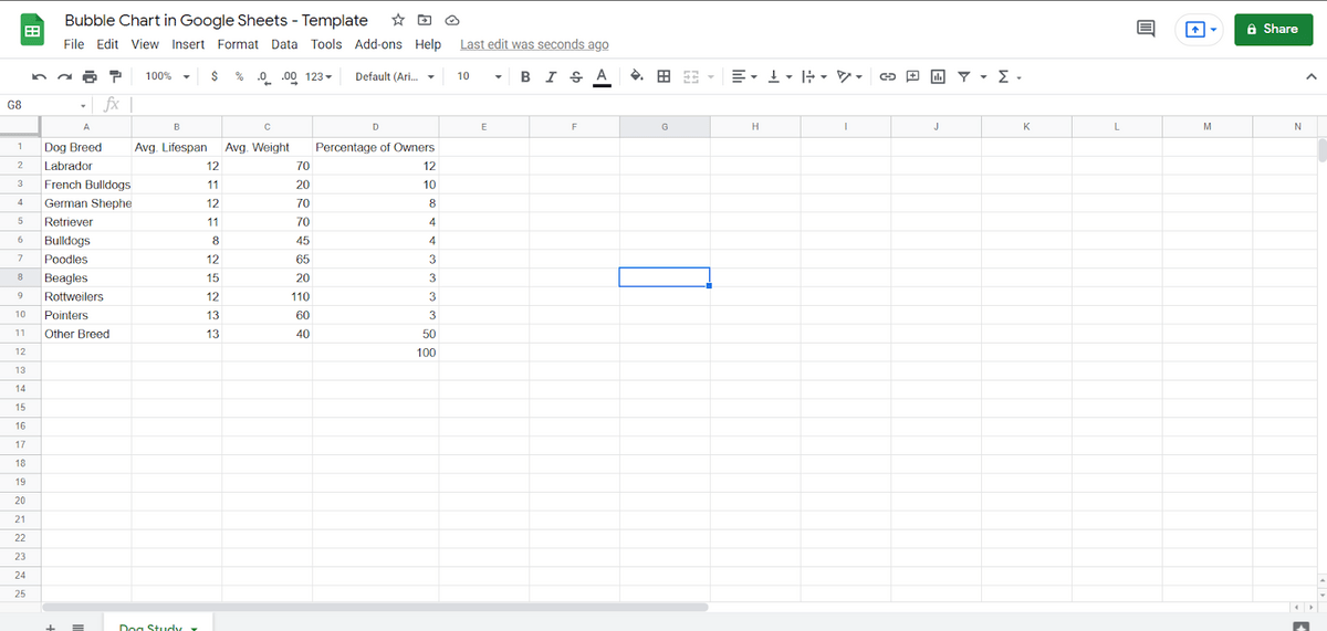
Let’s say we took a poll of dog owners about their dogs. Most of the people we polled had mutts, but the others had purebred dogs. In this case, we’re comparing weight and projected age.
With the data we have now, it’s really very hard to compare the data at all. It’s hard to see whether there’s a correlation between size and projected age. It’s hard to determine whether there’s a correlation between projected age and ownership.
This is why we use data visualization. Data visualization is the art of making data easier to interpret visually. A good chart is going to be instinctively “readable” at-a-glance. This is especially important for things like slideshow presentations and infographics — where information may need to be consumed quickly.
2. Create your chart
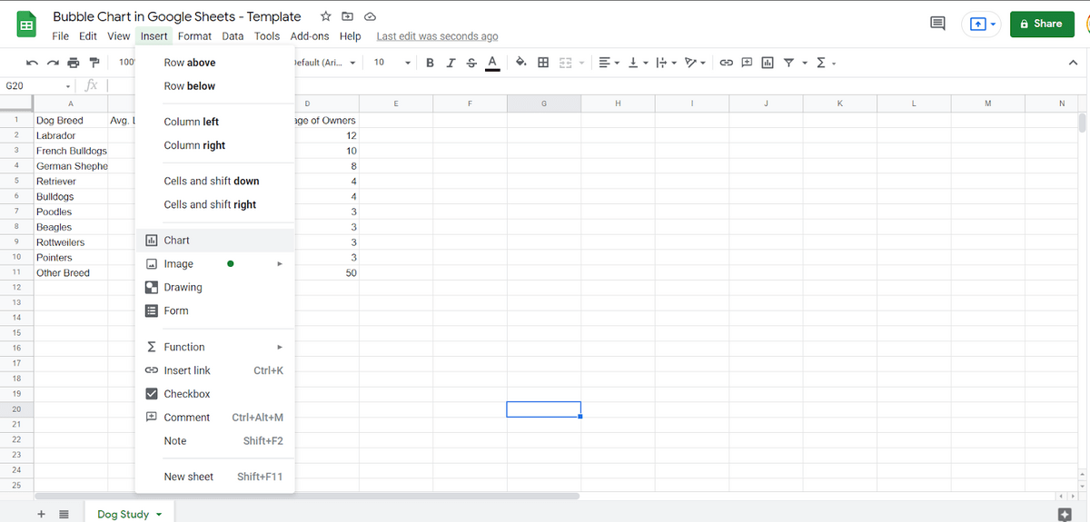
Once you have the data for your chart, it’s time to build your chart out. You create a chart by selecting your data and then going to Insert -> Chart.
This is the way you’ll create any type of chart. The first chart that will be created is a Column Chart. Looking at this Column Chart will help us better understand what a Bubble Chart does.
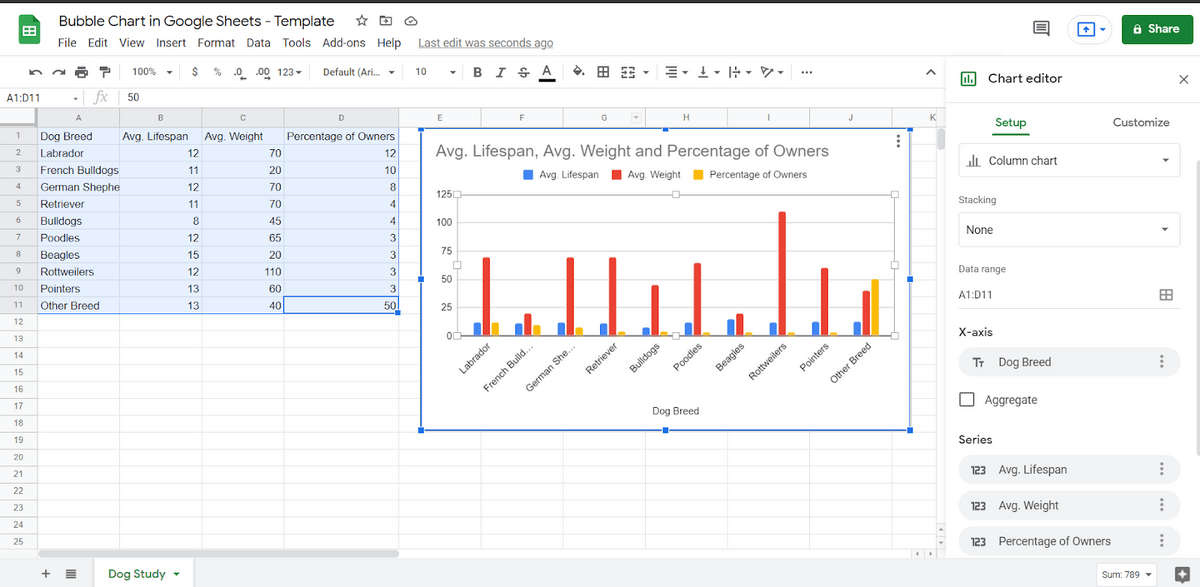
That doesn’t look terrible. But it’s also not very helpful. For each dog breed, we can see how much it weighs and how long it will live, but we don’t see the relationship between the two stats. And the percentage of owners is something else altogether.
3. Make your chart a Bubble Chart
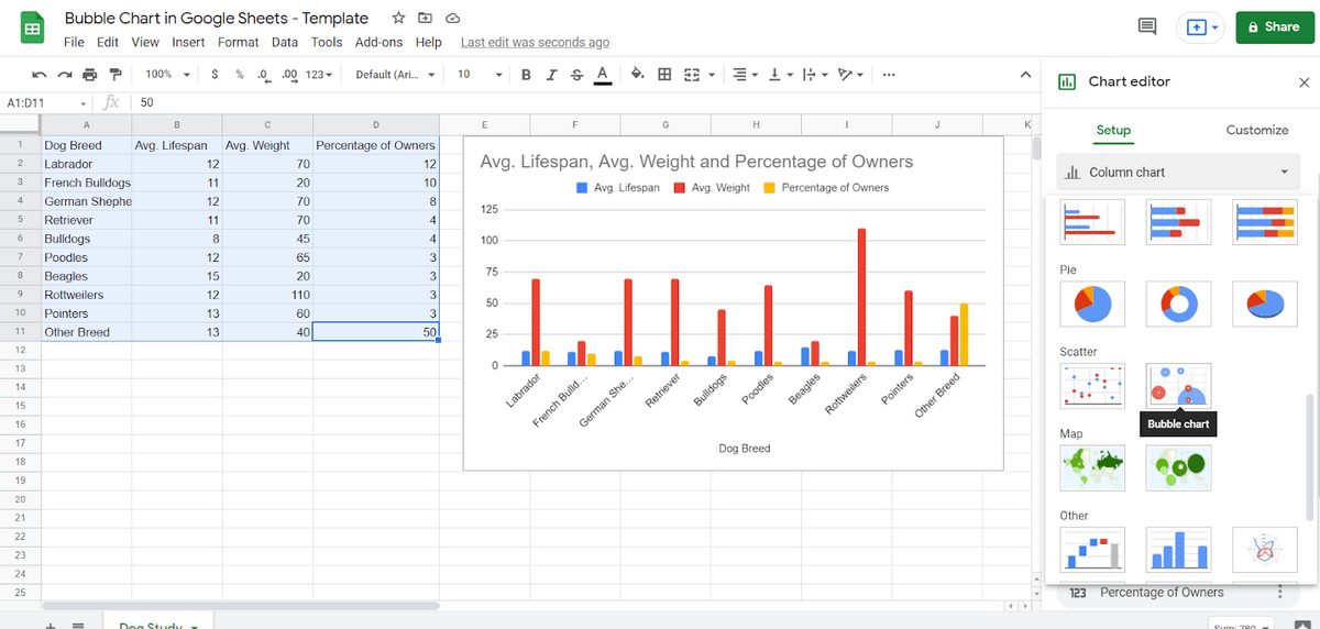
Select the chart and you’ll be in the Chart Editor. You can see right away that “Column Chart” is selected. Scroll down and you’ll see Bubble under Scatter.
You’ll have to scroll significantly far down. There are a lot of different types of charts in Google Sheets. Playing with different types of charts can help you figure out how to best visualize your data.
In customizing this Google Sheets bubble chart, we will set things as such:
- X-axis: Lifespan. This controls how far to the right the bubble is.
- Y-axis: Weight. This controls how far up the bubble is.
- Series: Dog breed. This controls the color of the bubble — it’s used for identification.
- Size: Percentage of owners. This controls the size of the bubble.
Thus, the X-axis, Y-axis, and size are all statistics, while the series operates as a label.
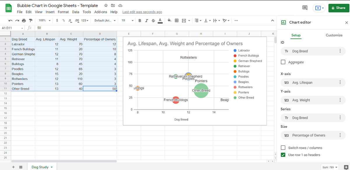
Now, you can see why the Bubble Chart is easier to read. You can see immediately that Beagles are both long-lived and small, while Bulldogs are comparatively shorter-lived. You can see that German Shepherds are very similar to Poodles. You can also see how generally popular each breed is.
Further Customizing Your Google Sheets Bubble Chart
Like other charts, Google Sheets Bubble Charts can be customized in the Chart Editor. Just switch from the “Setup” tab to the “Customize” tab.
Let’s try changing something. In the original chart, it’s a little confusing because it starts with bulldogs at 8 years — it makes it seem like bulldogs are very short-lived!
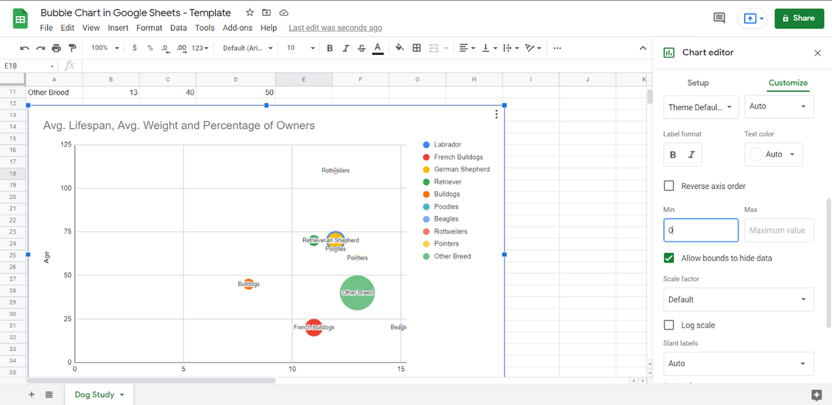
If we go under Horizontal Axis and change “Min” to “0” the entire chart changes. We start at “0” now on the horizontal axis, which shows data that is a little more optimistic.
Everything about your Google Sheets Bubble Chart can be customized, including:
- Fonts and font colors for the text on the chart.
- The colors of the circles displayed on the chart.
- Flipping the horizontal and vertical axis.
- Changing the title of the chart.
If there’s something about the physical representation of the chart that you want to change, you can very likely change it. You just need to look into the settings. You can also scale the chart to any size by dragging it.
Other Alternatives to a Bubble Chart in Google Sheets
There aren’t a lot of alternatives to a Bubble Chart because there are very few charts that can take on multiple values. One alternative to the Bubble Chart is a Combo Chart.
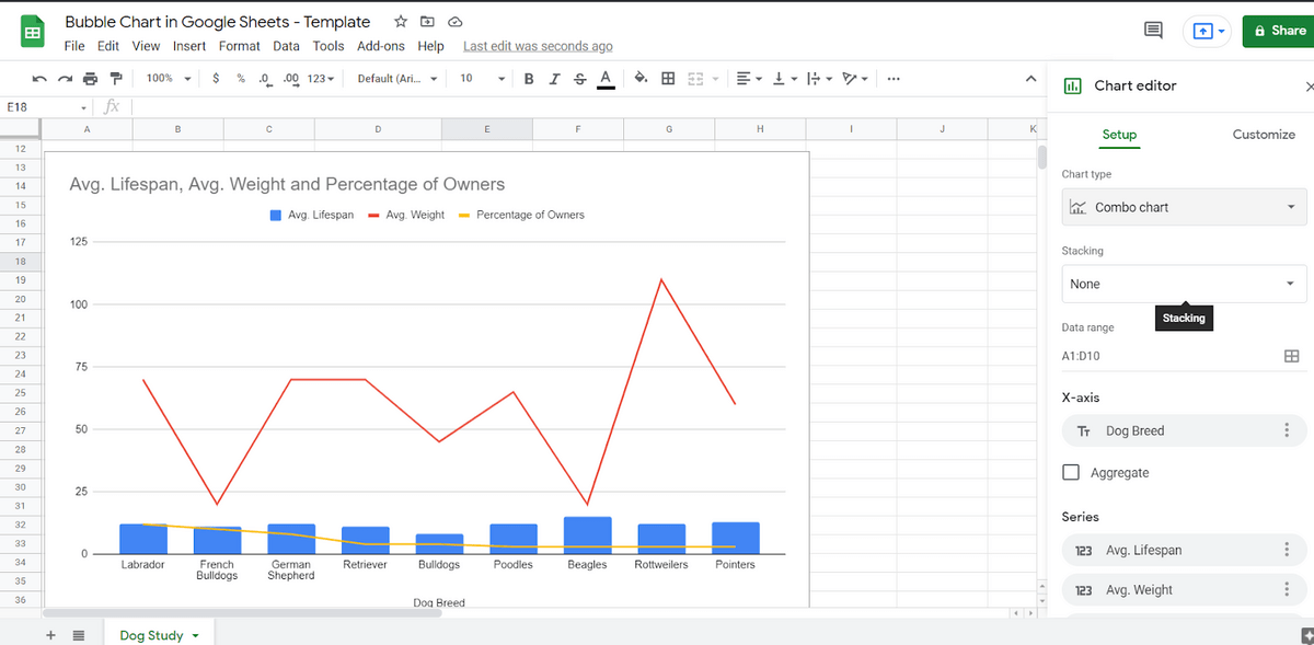
There’s always the Line Chart, too.
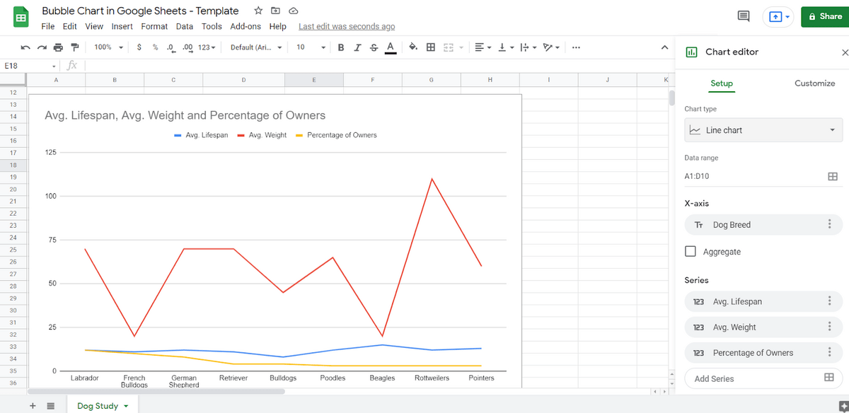
But neither of these options really does what a Bubble Chart does. Depending on your data, you might find that a Combo Chart or a Line Chart is more valuable.
Common Mistakes With the Google Sheets Bubble Chart
The most common mistake with a Bubble Chart, by far, is using it to express information that doesn’t need 3 values. If you only need 2 values, there are better options. Bar charts, pie charts, line charts, column charts — all of them will display the data better.
But a Bubble Chart is exceptionally valuable when it is necessary to display 3 values.
Other mistakes include:
- Confusing area with radius. A bubble chart depicts its data as an area of the bubble, not the radius. If you don’t know that, you might think the sizes are incorrect.
- Not using data that’s properly related. In our chart, age and weight actually are related. Though there isn’t a direct correlation, smaller dogs tend to live longer than bigger dogs.
- Using the wrong orientation. You can change the horizontal and vertical axis for the chart. And you might need to if your columns aren’t in the order the program expects.
- Not setting minimum and maximum values as needed. As we saw when customizing our chart, not setting a minimum value could lead to a potentially misleading chart.
The more you use your Bubble Chart, the easier it will be to customize.
Getting Started With Google Sheets Bubble Chart Templates
Are you ready to get started with Bubble Charts in Google Sheets? The easiest way to understand it is to work with a template.
Click on this Bubble Chart Google Sheets template, copy it, and then play around with the data.
Here’s some other tutorials you may be interested in: