Let’s talk about how to make a candlestick chart in Google Sheets. After all, charts and graphs give you a birds-eye view of your data and help you make inferences. I use a candlestick chart to track variations in values of a variable over time. And it’s not difficult to do.
In this tutorial, I’ll show you how to create a candlestick chart in Google Sheets. I included screenshots and easy-to-follow instructions. Read on for my full candlestick guide.
This Article Covers:
What is a Candlestick Chart?
If you already know how to use the GOOGLEFINANCE function in Google Sheets, you’ll likely want to display your findings with a visual. That’s where you might use a candlestick chart. It’s a common chart, and it should look pretty familiar.
A candlestick chart helps visualize opening and closing values, overlapped with the total variance in the value, as shown below:
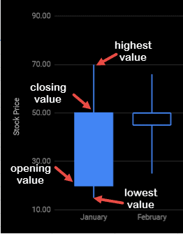
The candlestick chart can visualize OHLC (Open, High, Low, Close) data of stock securities by summing up all four details in a glance. Investopedia discusses this, too.
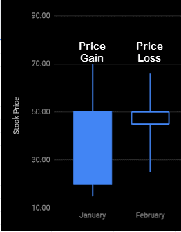
In Google Sheets, the candlestick is shown with a filled box when the opening value is less than the closing value (when there is a gain in the value), and with a hollow box when the opening value is more than the closing value (when there is a loss in the value).
This type of visualization provides a great way to understand variation in stock prices on a particular day, week, month, or over any period of time.
It is therefore quite often used to interpret stock value behavior. However, it can also be used to track scientific variables like rainfall and temperature.
Why Use a Candlestick Chart?
Many professionals rely on candlestick charts. They’re popular in financial applications, especially when stock price movements need to be depicted.
A candlestick chart, when properly formatted, gives us information about the opening and closing prices as well as the highest and lowest prices in a period of time, thereby giving us a full picture of the stock’s performance over time.
It also provides us the tools to identify trends in stock prices. So traders can use it to make forecasts of the short-term direction of the prices, thereby facilitating their trading decisions.
Moreover, candlestick charts are more visual, because of the thicker bodies of the candlesticks, making it easier to depict the differences between opening and closing values.
How to Make a Candlestick Chart in Google Sheets?
To create a Candlestick chart that correctly reflects your data and gives valuable insights, you need to go through a number of steps.
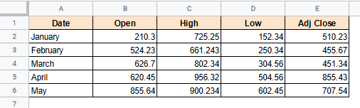
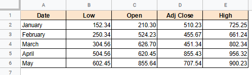
Let us say we have the following Open, High, Low, and Close data values of stock prices over 5 months:
We have shown below the steps that you need to take in order to create a good Candlestick chart from the given OHLC data.
Preparing the Data
Google Sheets makes it really easy and quick to create a candlestick chart, as long as your data is prepared and formatted in the correct order. You can code one, or you can create it right here in Google Sheets.
So the first and most important step is to prepare your dataset.
OHLC data is usually available in the order Open-High-Low-Close. However, Google Sheets requires your data to be in the order Low-Open-Close-High.
So before creating the chart rearrange your data columns if you need to and make sure your OHLC data is in the accepted format:

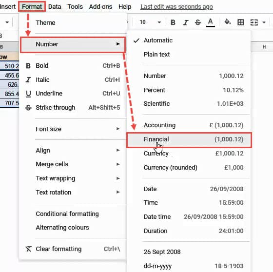
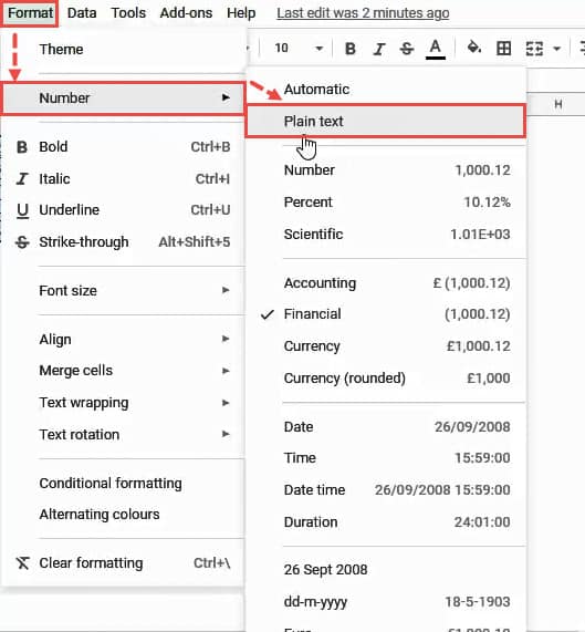
Next, convert your price values to the Financial format by selecting the values and navigating to Format->Number->Financial.
Make sure the date values in the dataset are in Plain text format. I discussed using the DATE function, too.
To add date values, just select the dates in your dataset and navigate to Format->Number->Plain text.
Now your dataset should be ready to be visualized.
Creating the Candlestick Chart
Now, let’s make this a visual. I discussed how to use Google Sheets as a database, but now we want a visual. So here’s how to make your data into a candlestick chart in Google Sheets.
Note that I included screenshots here to show exactly how to do it.
- Select the five columns:
- Date
- Low
- Open
- Adj Close
- High
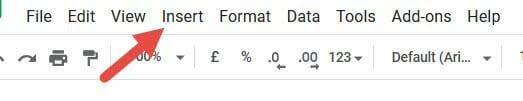
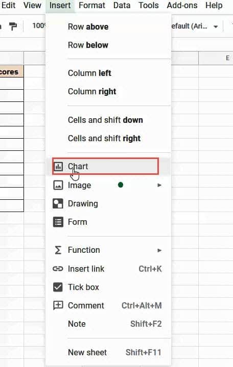
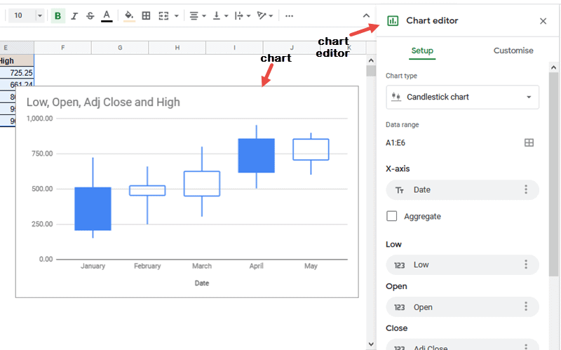
- Click the Insert menu from the menu bar.

 Google usually tries to understand your selected data and displays the chart it thinks is the best representation for it. Ideally, it should display a Candlestick chart. However, if you see some other kind of chart, go to step 6.
- To convert it to a Candlestick Chart, select the Setup tab from the Chart editor sidebar and click on the dropdown menu under “Chart type”.
- You should now see a Candlestick Chart on your worksheet.
 Google usually tries to understand your selected data and displays the chart it thinks is the best representation for it. Ideally, it should display a Candlestick chart. However, if you see some other kind of chart, go to step 6.
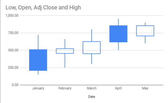
That’s it, you can now visualize OHLC values for the given 5 months.
Interpreting the Candlestick Chart
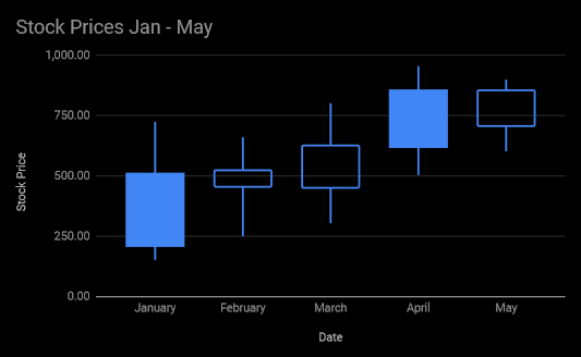
The candlestick chart consists of a candlestick for each period of time. In our case, there is one candlestick representing price fluctuations for each month.
This candlestick represents the price range between the open and close of the month’s trading. The base of the candlestick represents the opening price and the top represents the closing price.
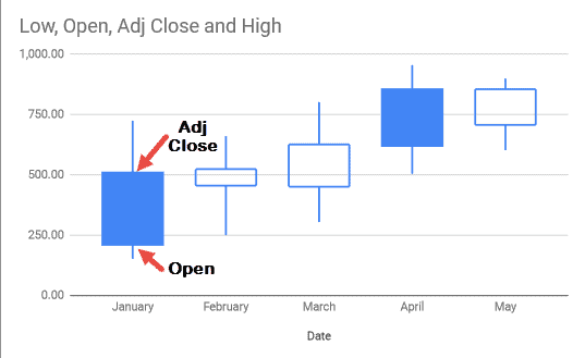
When the candlestick is filled in blue, it means the closing price was lower than the opening price, If it is hollow, it means the closing price was higher than the opening price.
Traditionally, a filled candlestick is shaded in green and a hollow one is represented in red. However, it is not possible to change the colors of the candlesticks in Google Sheets, at least not yet.
Just above and below the actual candlestick body are the shadows or wicks of the candlestick. The shadow on top shows the highest price of the time duration, while the shadow at the bottom shows the lowest price.
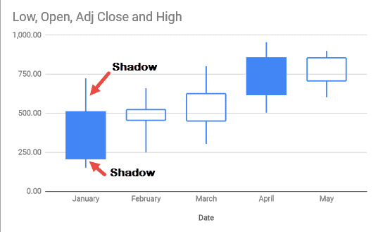
A short upper shadow means that the closing price was quite close to the highest price for the given time period, while a longer shadow means there was a great variation between prices throughout the trading period.
When you see a series of filled candlesticks moving upwards, it means the stock prices are showing an upward trend. Similarly, when you see a series of hollow candlesticks moving downwards, it indicates a downward trend in prices.
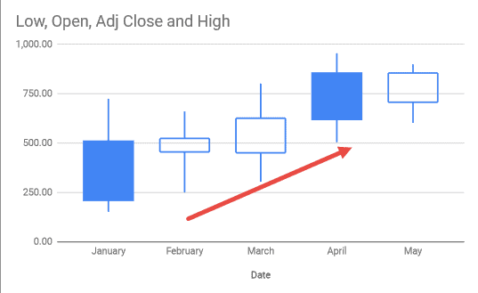
As such, using the patterns in the candlesticks, you can make predictions about the future prices of the stocks and start looking for trading opportunities.
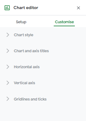
Customizing the Candlestick Chart
Although you cannot change the color of the candlesticks, there are some other customizations that you can apply to your chart in Google Sheets. Here’s how:
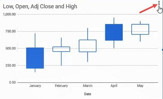
Usually, the Chart editor has a ‘Customize’ tab that lets you enter all your specifications. However, sometimes the Chart editor goes away after your chart has been created.
To make it appear again and to customize your chart, do the following:
- Click on the graph.
- You should see an ellipsis (or hamburger icon) on the top right corner of the box containing the graph.

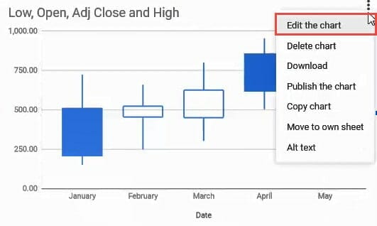
 Click on the Customize tab. You can now make your required customizations.
 Click on the Customize tab. You can now make your required customizations.
Changing the Chart Style
The Chart style category in the Chart editor lets you set the background color, border color,
font style, and size of your chart.
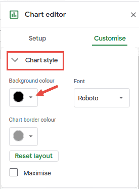
In our example, we changed the background color to “black”, and allowed the other settings to remain the same.

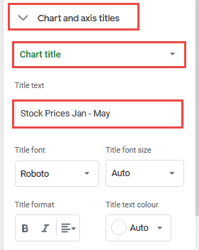
Chart and Axis Titles
This category lets you provide the text and formatting for the chart title and subtitle as well as the titles for both x and y axes. For example, you can use it to give the chart a proper title by typing the title “Stock Prices Jan – May” in the text input box under Title text:
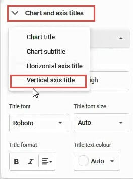
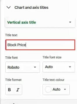
You can also add a title to the vertical axis, by selecting the “Vertical axis title” option from the dropdown menu and then set the title as “Stock Price”.
Your histogram would then look like this:
Horizontal and Vertical Axes
You can use this category to change the range of the vertical axis. For example, you might want to reduce the range of values within which you want the candlesticks to be distributed so that they appear larger in size.
In our example, you could distribute the scores between 100 and 1000.
For this, you will need to change the min and max values for the Vertical axis category to
100 and 1000 respectively:
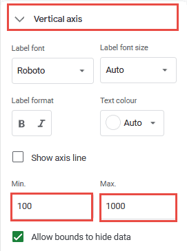
Some other settings available under these categories include:
- Label font to change the font for the horizontal and/or vertical axis.
- Label font size to set the font size for the x and/or y-axis values.
- Label format to make the x and/or y-axis values bold and/or italicized.
- Text color to change the text color of the
- Slant labels to display the axis labels at a particular angle.
Gridlines and Ticks
Finally, you can format the chart to contain major and/or minor gridlines. You can also set what colors you want the gridlines to be, or choose to not have them at all.
This category also lets you set and format major and/or minor ticks on your histogram’s vertical and horizontal axes. As before, you can choose to not have any ticks at all.
Note that you may also want to convert text to numbers in Google Sheets. That’s a pretty common issue, and it’s one I’ve discussed at length.
Conclusion
In this tutorial, I showed you why and how you can create a candlestick chart in Google Sheets. I included step-by-step instructions with screenshots for visual examples.
I also showed you how you can customize various components of a candlestick chart and make inferences from the displayed visualization. I hope you found it helpful!