

How to Refresh Pivot Table in Google Sheets
Pivot tables are powerful tools that let you gain very useful insights into your data. A common question on a lot of Google Sheets forums is “How to Refresh Pivot
Pivot tables are powerful tools that let you gain very useful insights into your data. A common question on a lot of Google Sheets forums is “How to Refresh Pivot
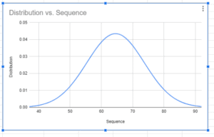
A bell curve is a useful graph for comparing how data points compare to the rest of the data. I am sure you have heard of people talking about getting

Sometimes, a visualization helps to group data and find patterns. That’s why I love a scatter plot in Google Sheets. They’re useful for showing trends and relationships in data when

Histograms are an incredibly useful way to show how data distributes into groups in a larger range. A histogram sorts data into “buckets” of closely related values instead of by
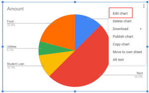
How to Make a Pie Chart in Google Sheets – Step-by-Step Video Tutorial: How to make a pie chart in Google Sheets? Pie charts are a great way to visually

Sparklines are miniature charts that you can create within a cell. These are quite useful when you’re creating a dashboard and want to quickly show a trend, seasonal increase or decrease,