A bell curve is a useful graph for comparing how data points compare to the rest of the data.
I am sure you have heard of people talking about getting an appraisal based on the bell curve.
This graph helps demonstrate where the majority of data points exist in a graph, how close those data points are to each other, and which data points are considered outliers.
This tutorial demonstrates how to create a bell curve graph in Google Sheets from an existing dataset.
While Sheets has a wealth of built-in graphing tools, you’re going to need to run a few calculations to generate a bell curve.
This Article Covers:
How to Make a Bell Curve in Google Sheets
Bell curve graphs tend to work best with data points that are generally closer to the average than compared with the extremes.
In our example, we’ll be working with a hypothetical list of 50 car review scores.

Before we can build our graph, we need to make a few calculations:
- The average (mean) value.
- The standard deviation value (either as the population or as a sample).
- The +/- 3 standard deviation values of the average.
- A range sequence.
- The normal distribution for all data points.
Before you start, create a series of helper columns to hold the calculations you’ll need to make your graph.

In the example, I’ve added the following columns:
- C: Sequence
- D: Distribution
- E: Average
- F: Standard Deviation
- G: Low
- H: High
Follow these steps to create a bell curve graph in Google Sheets:
- Calculate the average value of the data you’re building the bell curve for using the AVERAGE function. In the example, I’ve used the formula =Average(B2:B51) in cell E2.

- The average returns as 64.54 in the example.
- Determine the standard deviation using the formula =STV.P() if you’re working with all numbers in the population or =STV.S() if you’re working with a sample of data. The example uses the formula =STDEV.S(B1:B51) in cell F2 since it’s only a sample of available cars.

- The standard deviation returns as 9.1767 in the example.
- Calculate the low standard deviation value of the average with this formula: =average-3*standard deviation by referencing the corresponding cells. In the example, I’ve used the formula =E2-3*F2 in cell G2.

- The example returns a value of 37.0098
- Calculate the high standard deviation value of the average with this formula: =average+3*standard deviation by referencing the corresponding cells. In the example, I’ve used the formula =E2+3*F2 in cell H2.

- The example returns a value of 92.07
- Generate a sequence of numbers in the Sequence column using the following formula: =sequence(High-Low+1,1,Low). In the example, I’ve used the formula: =sequence(H2-G2+1,1,G2) in cell C2. This will return a sequence of whole numbers in the chart’s range.

- Next, calculate the normal distribution of all the data values using the NORM.DIST formula using this pattern: =ArrayFormula(NORM.DIST(Data Cell Range ,Average,Standard Deviation,false)). In the example, I’ve used: =ArrayFormula(NORM.DIST(C2:C57,$E$2,$F$2,false)) in cell D2.

- The will return distribution values for all scores.
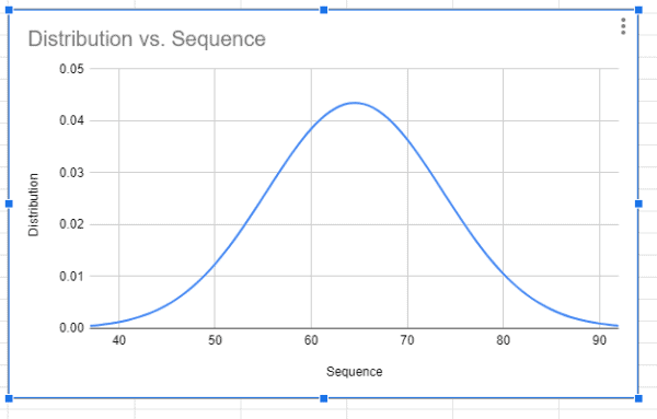
- Now it’s finally time to build the graph. To start, select all the values in the “Sequence” and “Distribution” columns.

- Open the “Insert” drop menu from the header and select “Chart.”

- In the chart editor, select the “Smooth line chart” from the “Chart Type” section on the “Setup” tab.

- Google Sheets will now display the bell curve chart based on the data in the workbook.


A wider bell curve implies a higher standard deviation, whereas a tall and thin bell curve means there’s a lower standard deviation.
What is a Bell Curve and How is it Used in Real Life?
A bell curve is a type of value distribution in which the data points cluster closely to the average.
This is usually used in business scenarios to find out the values that are lying far from the average dataset (as are thus outliers).
For example, if you compared the heights of a students in a class, you will see that most of these students are close to average, with some being or the right side of the bell curve (meaning these are taller than the average student), and some being on the left of the bell chart (meaning these are shorter than the average.
So, if you’re picking a team of basketball, where height is an advantage, you can focus more on students in the outlier group on the right.
You might use bell curve graphs to showcase data from stock investing, property values, classroom grades, review scores, and many other data groups that commonly consolidate values near the average.
This can help with deciding where to make safe investments or what makes for a fair offer on a property.
In particular, bell curves are useful for comparing review scores because the average score is often not the middle value in the scale.
For example, on a 1 to 10 rating system, most reviews may float around the 7, which defines the average. Alternatively, a batch of reviews that return a substantial amount of outliers from the bell curve may not be considered reliable.
This tutorial covers how to create a bell curve chart in Google Sheets. In real-world use cases, the creation of the bell curve chart is just the beginning of visualizing and interpreting data.
I hope you found this tutorial useful!
Other Google Sheets tutorials you may like: