Histograms are an incredibly useful way to show how data distributes into groups in a larger range.
A histogram sorts data into “buckets” of closely related values instead of by unique values. Google Sheets features an easy-to-use, built-in histogram graphing tool.
Instead of listing how many times someone scored a given percentage on a test, a histogram arranges scores into relative ranges.
For example, if we have a score of 10 students in a class for a test, using a histogram, we can bucket and see how many students scored in 51-60 marks bucket, how many in 61-70, how many in 71-80, and so on.
Histograms are also quite useful in the business world (especially service industry) and you will often find these in board room presentations.
In this tutorial, I will show you how to create histograms in Google Sheets.
This Article Covers:
How to make a histogram in Google Sheets
Before you can make a histogram in Google Sheets, you need some data to work with.
In the following example, we’ll use the ages of 15 hypothetical people who responded to a survey.
The following steps explain how to create a histogram in Google Sheets:
- Highlight the data you want to use to populate the histogram including the heading text. In the example case, we’ve highlighted the “Age” header and 15 values (see yellow rectangle).
- Next, open the “Insert” drop menu and select “Chart” from the options list (see blue arrows).

- On the chart “Setup” tab, select the drop menu under “chart type,” unless Google Sheets has automatically selected “Histogram.”

- Select the Histogram graph option type from the list under the “Other” section (see yellow rectangle).

- Congratulations! You’ve created a histogram. However, you can further customize the histogram to better express the data points.


Note — if you need to access the chart Setup/Customization menu do the following:
- Click the graph.
- Click the hamburger icon on the top right.
- Select the “Edit chart” option from the drop menu.

How to customize the histogram in Google Sheets
Google Sheets offers a wide range of customization and formatting options you can use to better showcase information. We’ll take a high-level look at what each of the chart editor features does.
Setup Tab
You’re already familiar with this tab because we used it to set the chart type. Some of the options on this tab are helpful in expanding the scope of your histogram. Other features help orientate the data based on how to interpret the columns and rows.
- Data Range: This feature is helpful if you want to include multiple columns and multiple rows in your histogram. For example, you can change this value to “A1:A16,B1:B16” to include rows 1 through 16 in both columns A & B.

- Series – Add Series: This feature is also used to add additional columns or rows in the histogram. To use it, select “Add Series,” highlight the series you wish to add, and click “OK.”

- Your histogram chart now contains two data series side-by-side.

- Your histogram chart now contains two data series side-by-side.
- Switch rows/columns: Select this to toggle between column and row data orientation
- Use row 1 as headers: This sets the top row value as a header in the key for the chart.
- Use column A as labels: This will use column A values as the header and key for the chart.


Customize Tab
There are many options you get in Gooogle Sheets to customize the histogram chart.
Most of these options are easy to understand and you will know exactly what it does when you give it a try,
I am also covering some of the options that are useful and may need some explaining.
Histogram
While only having three options, the Histogram options section is the most powerful tool in Google Sheets for data formatting.
- Show item dividers (checkbox): Check this to add a line between each item in the chart. Depending on the data, this may help better represent the distribution.

- Bucket Size: This lets you choose the value range for each bucket. Google Sheets has automatic sorting. You can set buckets by 1, 2, 5, 10, 25, and 50 increments
- Outlier Percentile: Use this option to group data outliers with the closest relevant bucket.

What’s the Right Bucket Size?
Choosing the right number and size range for each bucket is a combination of science and art. There are techniques to calculate the ideal amount of buckets.
However, you may want to adjust the buckets so the data breaks up the same way a person would break it up.
You can mathematically estimate how many buckets to use by taking the square root of the value count for the graph and rounding up.
If you have 10 numbers, the square root rounded up is 4. If you have 100 numbers, the square root rounded up (is exactly in this case) is 10.
However, when you’re dealing with number ranges that have relevant increments (like grade ranges, speed limits, and time intervals), you’ll want to use those instead.
It may help to use the square root method and then match up the bucket intervals to the closest common measurement. Grouping ages into ranges of 7 or 11 years won’t make a lot of sense, but 5, 10, or 15 will.
You can also use the later discussed Vertical Axis and Horizontal Axis minimum and maximum ranges to fine-tune the histogram.
Chart & axis titles
This submenu is helpful for adjusting how the chart title, chart subtitle, horizontal axis title, and vertical axis title display. You can set the following for each:
- Text: The selected feature display text. For example, the chart title might read “Histogram of Age” or “Respondent Age Histogram.”
- Font: Select the font-family
- Font Size: Choose how big this text element displays.
- Format: Set bold, italics, and alignment.
- Text Color: Choose the color for the selected text.

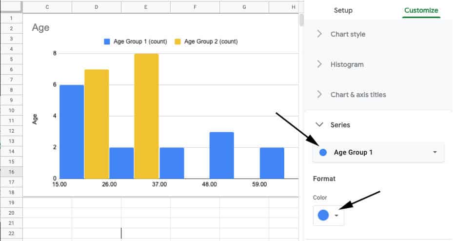
Series
This tab lets you choose the bar color for each series in your histogram. It’s particularly useful if you have a histogram comparing multiple series.
Adjust the series color with the following steps:
- Select the series you want to adjust from the main drop menu (top black arrow).
- Select the color you want to represent the series from the “Color” drop menu (bottom black arrow).
Legend
The “Legend” submenu lets you make adjustments to its namesake (in the above blue rectangle). The options make the following adjustments:
- Position: This moves the legend to the top, bottom, left, or right relative to the graph. Select “None” to remove the legend or “Inside” to move the legend on top of the chart.
- Legend font: Change the display font for the legend.
- Legend font size: Adjust the font size for the legend.
- Legend format: Bold or italicize the legend with these options.
- Text color: Set the legend’s text color.

Horizontal axis & Vertical axis
These two options sections serve the same purpose, but for the horizontal axis and vertical axis respectively.
These options let you adjust the range of the graph which can provide important context to a histogram. Additionally, they let you change the appearance of the axis information.
Min and Max (Setting the Range): These are very useful options for adding context to a graph. You can choose both the lowest (min) and highest (max) value represented in the histogram.
In our example data, Google Sheets breaks up the age groups in a way that doesn’t align with how people group ages. The default breakup looks like this:

The data range is from 18 to 65. Google Sheets automatically broke up the data into 15-26, 36-37, 37-48, 48-59, and 59-70 as default buckets.
It’s unlikely anyone would ever choose to break up people by these age groups if given the option.
Let’s take a step back and adjust the bucket size to an interval that makes sense to a person on the Histogram submenu. Changing the “Bucket size” to 10 will split the age groups into decades:

So we can use the “Min” and “Max” to represent decade age groups starting with 0. In this example, we’ve set the “Min” value to 10 and the “Max” value to 70.

Now we’re displaying the histogram data in a way that makes sense to a person looking at the data. We may opt to break the data into different age ranges like 5, 15, or 20 depending on the situation.
The other options relate to formatting the axis text:
- Label font: Change the font for the axis.
- Label font size: Force the text size
- Label format: Bold or italicize the text.
- Text color: Change the text color.
- Slant labels: Display the axis labels on an angle. This can make a crowded graph easier to read.
This example shows the horizontal access with size 18 Arial font that’s bolded, italicized, and slanted 30-degrees:

This is how you create a histogram in Google Sheets and customize how it displays. Remember, context is extremely important when interpreting a histogram.
While Google Sheets does a good job of formatting a histogram, a little customization can go a long way.
So this is how you can create a histogram chart in Google Sheets and use the different customization options to make it look the way you want.