How to Make a Line Graph in Google Sheets – Video tutorial:
Nothing conveys and represents data as clearly as a line graph.
From statistics to evolving data, line graphs are a sure way to record and monitor informational changes accurately.
With the use of line graphs, trends clearly appear, allowing individuals and companies alike to adjust their operational procedures to reach their overall goals and objectives.
Let us explore line graphs in more detail, and discover how to make a line graph in Google She
This Article Covers:
What Is a Line Graph in Google Sheets?
Before we dive into how to make a line chart in Google Sheets, let’s examine what they are.
Line graphs have straight, solid lines connecting solid, data points called “markers”, and display the line segments chronologically.
Line graphs have an “x-axis” (or horizontal axis) and a “y-axis” (or a vertical axis), which differentiate between the categories and the measurement values, respectively.
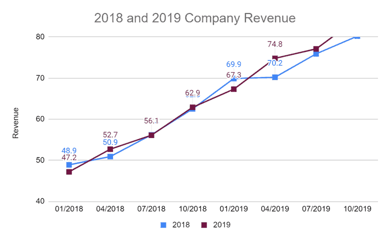
For example, if a company wants to compare their revenue between 2018 and 2019, a line graph would be the best way to display the information and observe the trends.
But before an effective and efficient line graph is created, it’s important to know what the essential parts of a line graph are. By understanding the different parts of a line graph, information can be displayed in the way it is meant to be conveyed.
So, let’s examine the different parts of a Google Sheets line graph, and then discover the steps to create one!
Important Parts of a Line Graph
The important parts of a line graph include:
Y-Axis (vertical axis)
X-Axis (horizontal axis)
Chart Title
Markers
Grid
Y-Axis Label
X-Axis Label
Legend
Purpose of Line Graphs
But what exactly is a line graph? A line graph is a graph that displays the relationship between two or more changing quantities over time. However, a line graph can also display just one changing quantity if there is nothing to compare it to.
The best time to use a line graph is when you need to demonstrate trends, changes, increases, decreases, etc. A line graph is more intuitive to show changing and evolving trends than other types of graphs.
Check also other ways how to track changes in Google Sheets.
Line graphs are best used for:
Showing evolving data
Showing how two continuous variables relate to one another
So, let’s dive right in and start creating a Google Sheets line graph.
How to Make a Line Graph in Google Sheets With Multiple Lines
Below are the steps to make a line chart in Google Sheets with multiple lines, to do a single line, you just have to select one set of numerical data instead of two in step one.
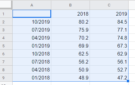
Step 1: Enter Data in Google Sheets.
This is the most important step because what you enter in your Google Sheets spreadsheet is what will be conveyed in your line graph.
Below is the entered data for the example above. Notice how cell A1 is empty.
If you are creating a multiline graph, cell A1 will always be empty.
Step 2: Highlight the Data, and Click on the Chart Icon.
Select the entire dataset for which you want to insert the line chart and then click on the chart icon in the toolbar.
You can also do the same by going to the Insert option on the menu and then clicking on the Chart option.
However, most of the time, Google will determine the entered data is appropriate for a line graph, and will automatically populate one for you so you don’t have to select it.
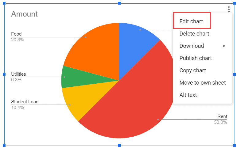
In case it doesn’t,
Click on the chart
Click on the three dots that appear on the top-right part of the chart,
Click on Edit chart
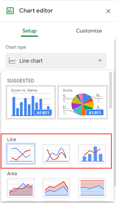
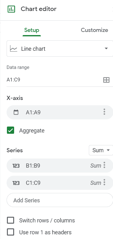
This will open the ‘Chart editor’ pane on the right. You can change the chart type from the ‘Chart type’ options (and select a line chart if that has not already been inserted)
Once you have the line chart in the worksheet, you can now fine-tune the chart using the Chart Editor.
Step 3: Choosing the Right Chart Type Settings
In the Chart editor, you get access to a number of ‘Chart type’ setting options.
This first dropdown box under “setup” allows you to select the type of graph you want to use. The three options include:
Regular Line chart
Smooth line chart
Combo line chart
Here’s how to do a line graph on Google Sheets with the different styles.
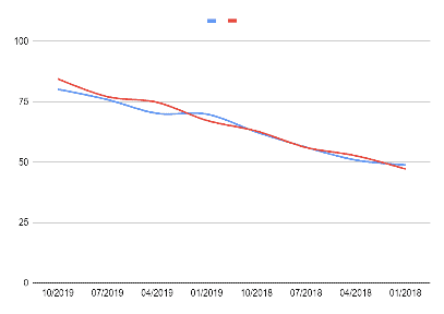
The image below is of a regular line chart
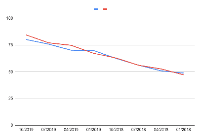
The image below is of a smooth line chart
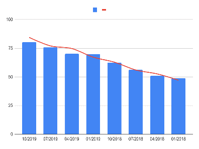
The image below is of a Combo line chart
A regular line graph will have a more jagged appearance, while a smooth line graph will have flowing lines. A combo line graph will combine a line graph with a bar graph. While the choice for how you want your graph to appear is yours, the most popular choice is the regular line graph as the data is displayed more directly and precisely.
Note that the combo line chart only makes sense when you have two series of data.
Below are some other options you have in the Chart setup pane:
Data range: This is the range of cells you highlighted from your spreadsheet to create your chart.
X-Axis: This is the range of cells from your spreadsheet that make up your chart’s X-Axis.
Aggregate: When the aggregate box is checked, it allows you to aggregate all values that share an identical X-Axis key. For your series or lines, the aggregate dropdown box will give you the option of displaying the data’s:
Average
Count
Max
Median
Min
Sum
Series: Each line represented in your chart is called a “series”. The three dots at the end of the series bar give you the option to add labels or remove them.
Switch Rows/Columns box: When checked, this will change your X-Axis data to the Y-Axis, and vice versa.
Use Row 1 as Headers: By checking this box, you’re using the labels from row one of your spreadsheets and creating a legend for your chart.
Step 4: Doing Some Chart Customization
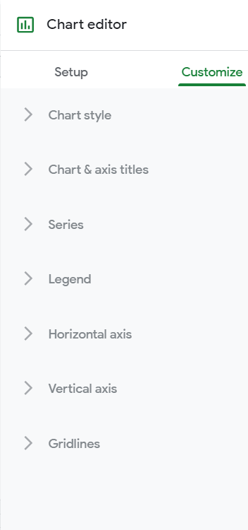
Now that you know how to create a line chart in Google Sheets, you should learn how to customize it. The Customize tab will allow you to change the:
Chart style
Chart and axis titles
Series
Legend
Horizontal Axis
Vertical Axis
Gridlines
From font style to font size and from alignment to color, the customization tab truly allows you to make your chart your own.
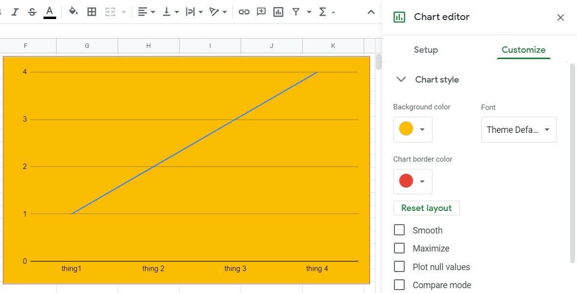
Chart Style
Under this section, you’re given the opportunity to change the background color of your chart, as well as the chart’s border color and font. You can decide if you want your chart to have smooth lines, a maximized view, plotted null values, or a compare mode layout.
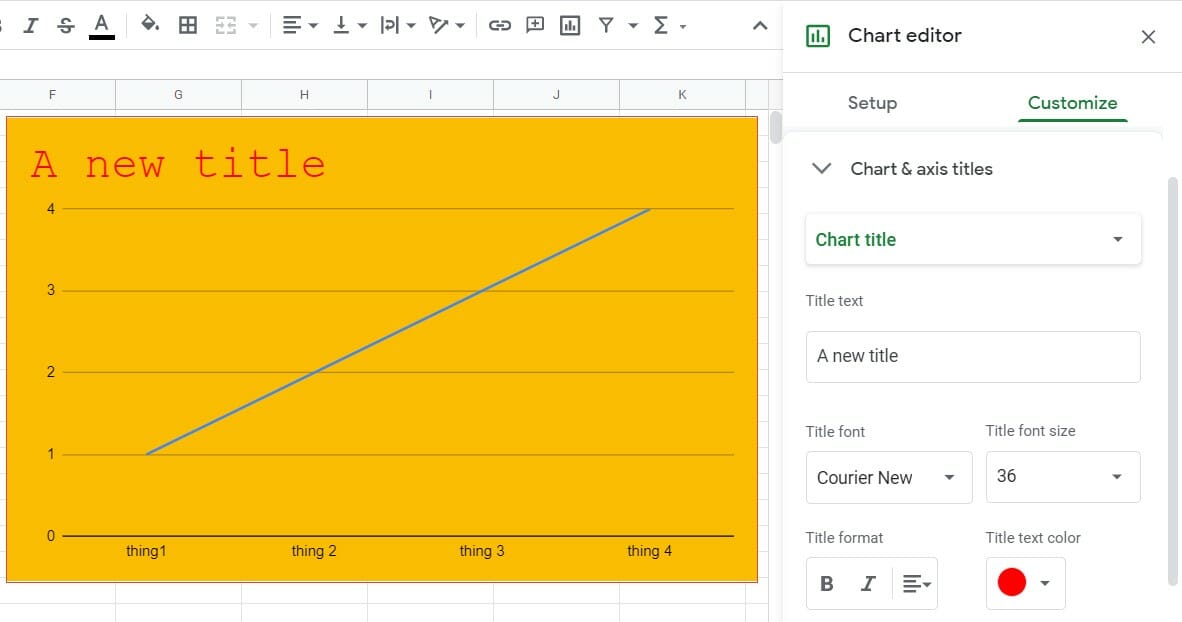
Chart & Axis Titles
Every chart needs a title so the audience knows what information they’re looking at. The chart and axis title section allows you to not only give your chart and each axis a title, but change the font style, font size, format, alignment, and color as well.
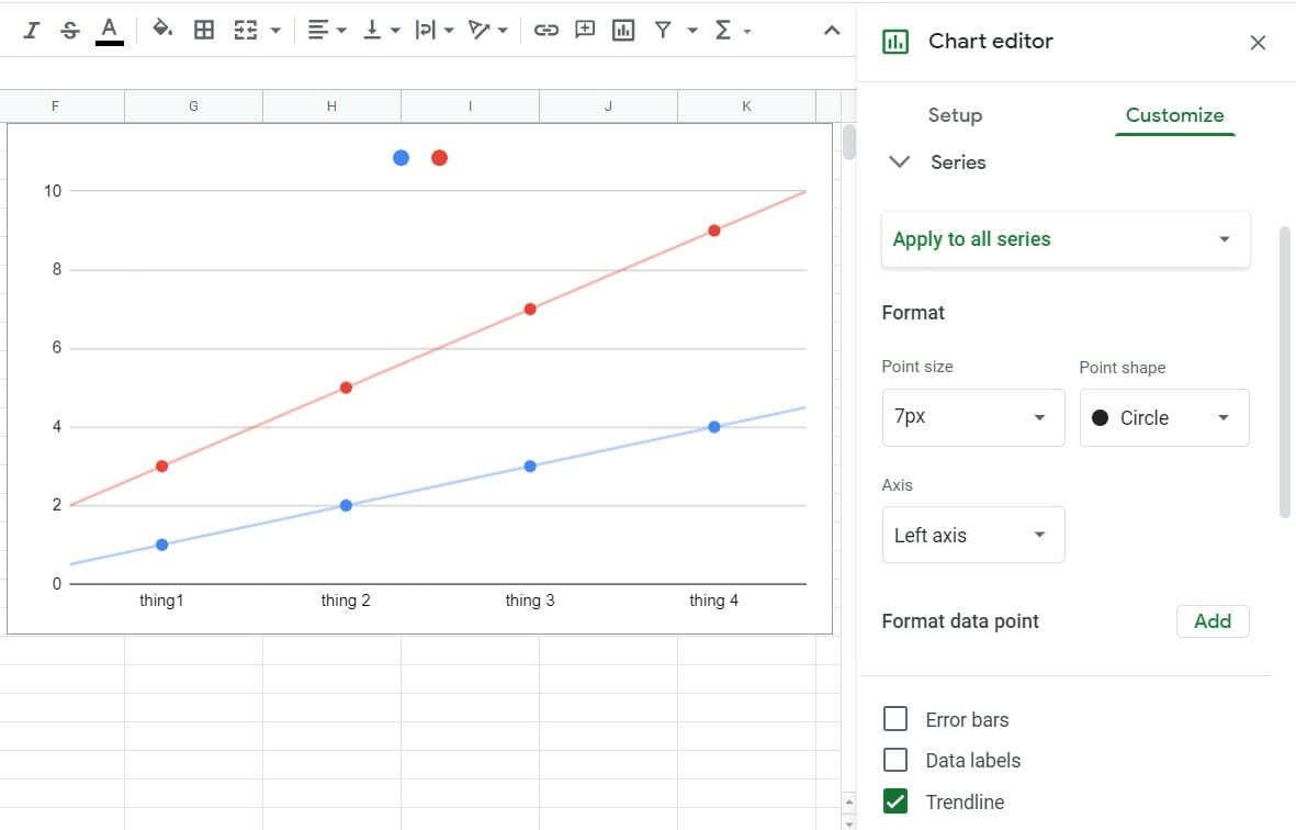
Series
Here you can customize the style of your lines. By adjusting each line’s thickness, the marker point size, and the marker point shape, you can create the chart that most clearly displays the information you want to convey. In this section, the aggregate dropdown menu allows you to select the type of aggregate you want your chart to display. You can even customize a specific marker on your chart under “format data point” 🡪 “add”. You can even select to display features such as error bars, data labels, and trendlines.
Legend
This menu allows you to position your legend in your desired spot, as well as change the legend’s font, size, format, and text color. Read the full guide on how to label legends.
Horizontal Axis
Like the customization options above, the horizontal axis menu gives you the opportunity to change the label font, label font size, label format, and text color. Two boxes under this section also allow you to alter your chart by creating labels as text and reversing axis order.
Vertical Axis
Once again, with a choice of font, font size, format, and color, this menu option has two blank boxes to enter minimum and maximum values for the Y-Axis. You can check the box “treat labels as text”, as well as change the scale factor to include punctuation in your values. If you wish, you can customize the vertical axis by checking the “log scale” box, as well as changing the number format by selecting your desired style from the corresponding dropdown menu.
Gridlines
Gridlines can be helpful when displaying data. They provide a perspective that helps an audience better understand and comprehend the data provided. By selecting the major and minor gridline count, as well as the major and minor gridline colors, charts certainly come to life as does the data they display.
How to Make a Line Graph on Google Sheets FAQ
How Do You Make a Line Graph on Google Sheets?
To learn how to create a line graph in Google Sheets you just have to follow these easy steps:
Highlight the data you wish to make a line graph from
Click the chart icon in the tools menu or navigate to Insert > Chart
In the Setup tab of the Chart editor change Chart type to Line chart
Make any desired changes in the Customize tab
How Do You Make an XY Line Graph in Google Sheets?
To learn how to make line graph in Google Sheets of the XY variety you should use a scatter plot with a line of best fit instead of a line graph. To do so:
Select Scatter chart in the Setup tab of the Chart editor
Navigate to the Customize tab and click Series
Check the Trendline box
You could also refer to this method as learning how to make a linear graph in Google Sheets.
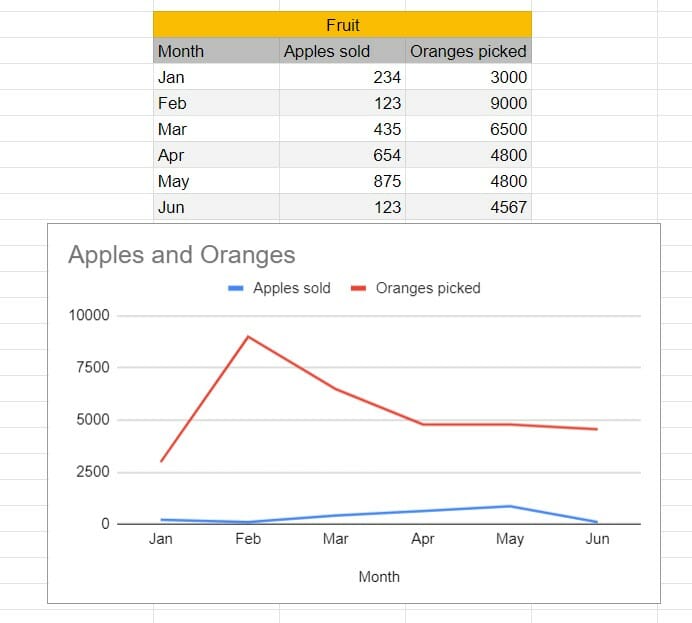
How Do You Make a Line Graph in Google Sheets With Two Sets of Data?
Learning how to make a line graph in Google Sheets with two or more sets of data is simple. You just have to make sure your two data sets share a comparable parameter for the Y axis. The old adage of you can’t compare apples to oranges doesn’t apply here. Let’s take a look at an example:
You can see that this example works because the Fruit Sales for each month can be plotted on the same graph. Yet, if you tried to plot the sales of apples against the seasonal ripeness of oranges you would have trouble.
The comparable data points can be different as long as they remain numerical and are properly labeled like in the example below that compares apple sales to orange picking rates.
You could also use a scatter plot with a trendline for similar purposes.
Lining up Your Next Graph
So this is how to make a line graph in Google Sheets. We hope this tutorial has helped you learn exactly how to make a line graph easily in any Google Sheet you may be working on. If you found this article useful, check out our other charting tutorials.
Sumit is a Google Sheets and Microsoft Excel Expert. He provides spreadsheet training to corporates and has been awarded the prestigious Excel MVP award by Microsoft for his contributions in sharing his Excel knowledge and helping people.