
How to Create a Funnel Chart in Google Sheets [Step-by-Step]
There are several ways you can visualize your data in Google Sheets. Unfortunately, there is no simple funnel chart setting, so you have to be a little creative. You
There are several ways you can visualize your data in Google Sheets. Unfortunately, there is no simple funnel chart setting, so you have to be a little creative. You

Watch – Radar Chart Google Sheets Video Tutorial Google Sheets radar charts are an effective tool for visualizing data sets to compare and contrast. A radar chart will provide

It is no surprise that Google Sheets is great at storing data. Google Sheets is also well equipped with easily created charts and graphs, providing a visual representation of the
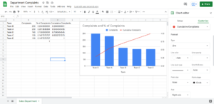
What is Google Sheets for if not charts and graphs? Charts and graphs are what make Google Sheets so readable. Charts are a form of visual data. While Google
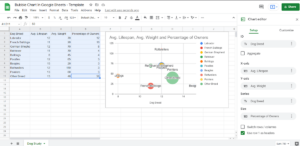
Bubble Charts are a special type of chart that’s generally used to display multiple dimensions of data. In Google Sheets and Microsoft Excel, there’s a special “Chart” function that includes
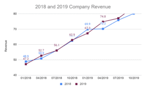
How to Make a Line Graph in Google Sheets – Video tutorial: Nothing conveys and represents data as clearly as a line graph. From statistics to evolving data, line graphs