Recent Posts
Pivot tables are powerful tools that let you gain very useful insights into your data. A common question on a lot of Google Sheets forums is “How to Refresh Pivot Tables in Google Sheets?” How to ...
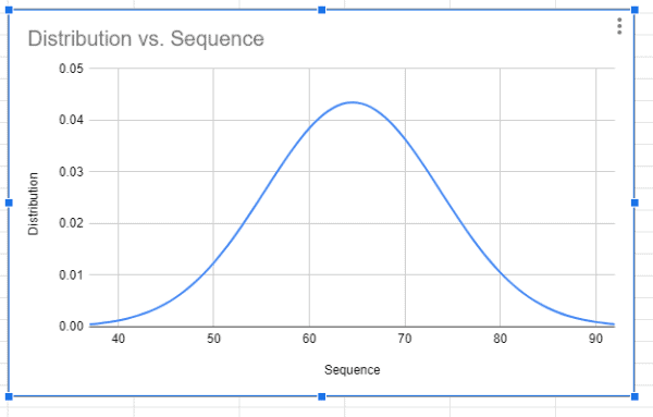
A bell curve is a useful graph for comparing how data points compare to the rest of the data. I am sure you have heard of people talking about getting an appraisal based on the bell curve. This...
Sometimes, a visualization helps to group data and find patterns. That’s why I love a scatter plot in Google Sheets. They’re useful for showing trends and relationships in data when other ...
Histograms are an incredibly useful way to show how data distributes into groups in a larger range. A histogram sorts data into “buckets” of closely related values instead of by unique values. Goo...
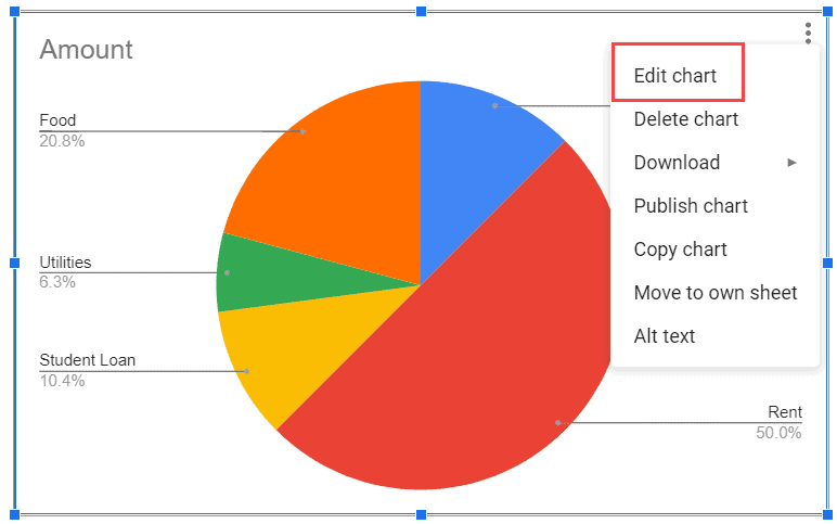
Learn how to make a pie chart in Google Sheets is easy with this simple %currentyear% guide with several step-by-step examples....
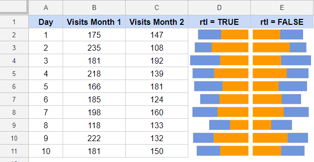
A Sparkline is a miniature chart that you can create within a cell. These are useful when creating a dashboard, Learn how to use this feature today....