What is Google Sheets for if not charts and graphs? Charts and graphs are what make Google Sheets so readable.
Charts are a form of visual data. While Google Sheets can keep data in columns, rows, and cells, that data isn’t always easy to read at a glance.
By using charts like the Pareto chart on Google Sheets, you can create data that can be read, consumed, and understood quickly. This form of analysis is both extremely helpful and extremely accessible — but it can also take a little work.
Let’s look at Pareto chart Google Sheets options: what they are and how to make them.
This Article Covers:
What is a Pareto Chart — And What Is It Used For?
A Pareto chart is a chart that is simultaneously a column graph and a line graph.
Column graph data is organized in columns that descend by the value of the data. Pareto charts are generally used to illuminate the largest values — the values that might be either more important or more problematic for an organization.
An example of a Pareto chart might be a safety chart, of departments that had the most safety incidences. But it could likewise be a chart of sales professionals who had the best sales. Either way, the data would be structured in a way that shows the performances of the departments or professionals ranked against each other.
A Pareto chart shouldn’t be confused with the 80/20 rule or Pareto principle, which is a separate principle which states that 80 percent of results come from 20 percent of the individuals.
Pareto Chart Google Sheets Guide – How to Make a Pareto Chart in Google Sheets
First, we need the right data to create a Pareto chart. As we know, Pareto charts are meant to compare bar graph data. So, there’s some information that really wouldn’t be applicable to a Pareto chart — largely, any data through which comparison would be meaningless.
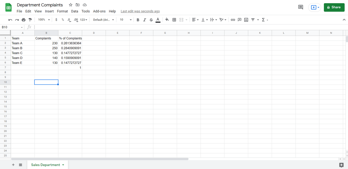
We’re going to look at a case in which there have been department complaints (oh no). We have multiple sales teams and we want to know which department is the “worst.” At the far right, we have cumulative data; the percentage of complaints each department is.
Step One: Validate the Data
Before we do anything, we want to go to Data -> Sort. Then we can focus on how to make a Google Sheets Pareto chart.
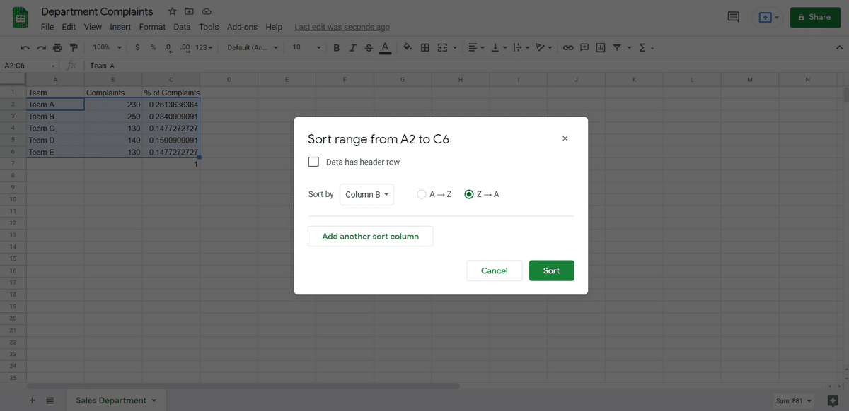
The data is going to be sorted in descending order based on complaints so the chart comes out correctly.
If we miss this step, the chart isn’t going to be properly organized when we’re done.
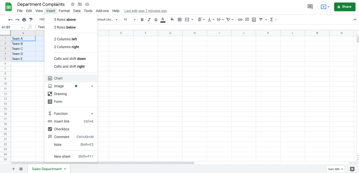
Step Two: Create a Chart
When we’re working with charts, step one is always to create the chart itself. We go to Insert -> Chart for this function.
Google Sheets will at first “guess” based on what it thinks we want the chart to be. Regardless, we want to select a combo chart.
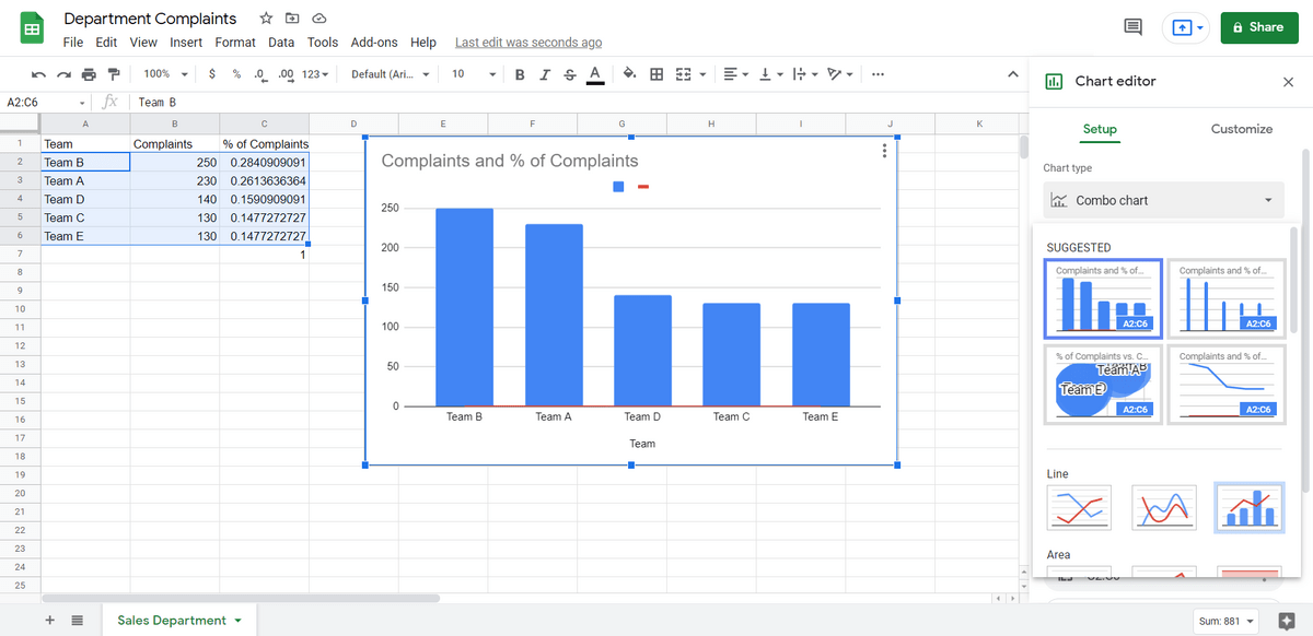
That’s good, but the data isn’t properly formatted yet. As you can see, we can see that Team A gets the most complaints and Team C and Team E get the least. But the red line is flat.
Step Three: Customizing the Chart
Next, we want to add another column to the right of our existing data. Our current one shows the percentage of complaints. But what we really want is cumulative complaints.
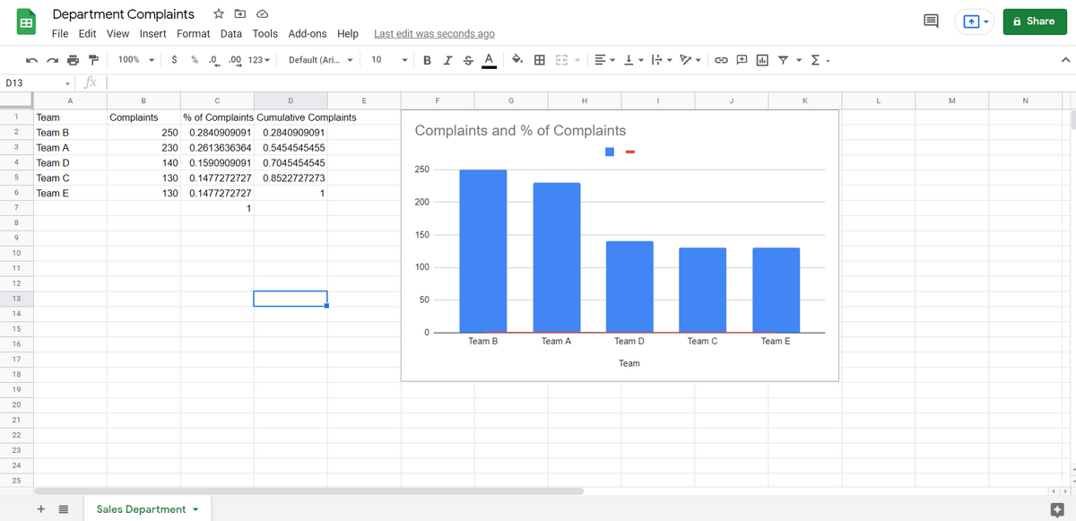
Our new column simply adds together the percentages over time, until it gets to 100 percent.
We go to Customize then “Series.” Under Series, we select “Cumulative Complaints.” And then we assign that to the Right Axis.
By doing this, we set the red line of the combo chart to reflect cumulative complaints.
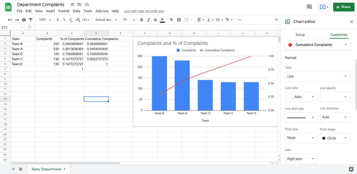
(Note that in order to have the graphs labeled, we also need to go into the Chart Setup and select “Use Row1 as Headers.”)
How to Create a Pareto Chart in Google Sheets – FAQ
What the Is 80/20 Rule in Pareto Charts?
If you’re familiar with the 80/20 rule under any context, it would be safe to insinuate the meaning of it here. basically, it just means that 80% of the outcomes come from 20% of the causes.
How Do I Add Data Labels to a Pareto Line?
You can add data labels to a Pareto line you just have to navigate to Chart setup and check Use row 1 as headers.
What Is the Difference Between a Pareto Chart and a Bar Graph?
A Pareto chart is a column graph with a line graph over the top that shows the cause and effect between two parameters – one being a cumulative visualization of the data from the other.
A bar graph is a horizontal graph that usually only displays one set of data.
Using Your Pareto Chart
By seeing a Pareto chart, you can probably figure out how to best use it. It’s best used when you want to see how data becomes a cumulative whole — and when you want to sort your data in either descending or ascending order.
Some use cases include: seeing how much profit each team made, seeing how many health incidents have occurred and seeing how many five-star ratings a team has received. No matter what you’re building them for, if you followed this Pareto chart Google Sheets guide, you’ll be able to make them with no issues.
Related reading: