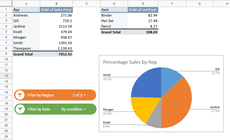
It is no surprise that Google Sheets is great at storing data. Google Sheets is also well equipped with easily created charts and graphs, providing a visual representation of the data. These charts are easily made, edited, and customized.
However, many users may not know how to use these charts, so this tutorial will discuss creating, editing, and customizing a combo chart in google sheets.
What is a Google Sheets Combo Chart?
As one might guess, a combo chart is a chart built with multiple data points using a combination of charts. This combination is designed and intended to present data in a visually logical and meaningful way.
One typical example of a Google Sheets combo chart is a line chart merged with a column chart to create a visually clear message. The slope in the line chart depicts the rate of increase or decrease, while the column chart marks the values.
How to Make A Combo Chart in Google Sheets
- Decide what data set will be used to create the chart and select the data needed by clicking and dragging over the required portion of the data set.
- Click the Chart button in the top right of the toolbar. OR, in the menu, select the Insert tab; you will see a chart option, choose that.
- In Chart type, Select “Combo Chart.”
About the Combo Chart
In the resulting combo chart, we will see various elements. It is essential to understand what these elements and their data points represent in the data set before editing and customizing the combo chart.
Within the Google Sheets Combo Chart, we have the following sections (moving top to bottom):
- Title
- Legend
- Vertical Axis
- Data Series
- Horizontal Axis
- Axis Title
How to Edit Your Combo Chart
To edit any of the elements of the chart, follow these steps.
- Select the chart.
- Click the three dots in the top right corner of the chart.
- Select Edit Chart.
The remaining steps will depend on the section you are hoping to edit.
How to Edit the Data in a Combo Chart
When you open the Chart Editor, you will see it appear on the right side of the screen. At the top of the editor, if it is not already selected, select Setup. Here you can change the data and the way it communicates with the combo chart.
Stacking
- is used to see the percentages related to the data. However, it is not effective in this example.
Data range
- The range used for the data.
- Automatically selected when you selected the data table cells at the start of this process.
- You can use the grid button to the right of the current range to choose a different range/s.
X-axis
- The horizontal axis selector.
- The horizontal axis is automatically set based on the data.
- If it is incorrect or if the data changes, it can be updated here.
- To edit the range, click the name of the X-Axis, and it will bring up the options box to select another range.
- The Label is set based on the column label in the data table. You will need to change the column label in the data table or change it in the customize section.
Aggregate Check Box
- This checkbox will allow you to select and aggregate data options for the data series.
- For this example, it does not apply well. However, if you had multiple data points within one month, it would come in handy. It allows you to sum, average, median, and more any of the data series.
Series
- Where you view and edit your data series.
- The Label is set based on the column label in the data table. You will need to change the column label in the data table or change it in the customize section.
- To edit the range, click the name of the series, and it will bring up the options box to select another range.
- You can also add new series here. These series must be the same size range, but they do not have to be consecutive. For example: currently, the series is in Columns C4:C15, D4:D15, and E4:E15. You could also have a series in column H4:H15.
Checkboxes
- Switch rows/columns: This swaps the rows and columns if the table is opposite this one.
- Use row * as headers: uses whichever row is in the table headers position.
- Use column * as labels: uses whichever column is in the table labels position.
How to Edit the Appearance of a Combo Chart

When you open the Chart Editor, you will see it appear on the right side of the screen. At the top of the editor, select Customize. Here you can customize the chart’s appearance, which allows you to brand it with company colors or stick to an existing color scheme.
Chart style
- Here you can edit the overall chart elements.
- You can change the background, font, and border.
- Checkboxes:
- Smooth: removes jagged edges from the line chart
- Maximize: removes blank border space and enlarges to max amount.
- Plot null values: this toggles on and off, showing the null (blank) values.
- Compare mode: allow comparisons to previous values.
Chart & axis titles
- Title, Font, and Color of Title.
Series
- Series enables you to edit the combo charts visualization.
- When you first open this, it will be on “Apply to all series” change to the series you wish to edit.
- You can now edit the type (Columns, line, and area), color, opacity, dash type, thickness, and axis side.
- You can also add error bars, data labels, and a trendline. All of these can benefit the effectiveness of the data’s message.
Legend
- You can change the position, font, and color of the legend.
Horizontal Axis
- You can change the position, font, slant, and color of the Horizontal Axis
Vertical Axis
- You can change the position, font, number format, scale, min/max value, and color of the Vertical Axis
Gridlines and ticks
- You can change the gridlines and ticks for both the vertical and horizontal axis.
- The vertical axis has many more options in this example. You can change the spacing, step, count, color and select various ticks and gridlines.
- The horizontal axis has only one choice in this example and provides ticks along the axis.
Conclusion
Building a combo chart in Google Sheets is not complicated. With just a few clicks, you can turn a data set into an effective combo chart. Once you have created a chart, editing that chart can be fun and exciting. A visually appealing chart is much more likely to portray the intended message. We have covered how to create, edit, and customize a combo chart, and I hope this has helped you in your Google Sheets journey.
Related:
- How to Make a Pareto Chart in Google Sheets
- How to Make a Bubble Chart in Google Sheets (Easy Guide)
- Creating Candlestick Chart in Google Sheets (Step-by-step)
- How to Make a Pie Chart in Google Sheets (Step-by-Step)
- Pivot Tables in Google Sheets
- How to Set the Print Area in Google Sheets
- An Easy Guide to Google Sheets Percentage Formula (3 Ways)


