Google Sheets provides users the ability to create a wide variety of charts to visualize their data. Charts provide an effective way for you to understand differences, proportions, and trends in your data.
But just displaying a chart with a bunch of columns or lines of different colors is not enough.
The person looking at your chart should be able to gain insight into what they mean. That is why it is essential to include a legend with your chart that tells the viewer what each of these lines, shapes, or colors means.
Google Sheets does provide the option to include legends with labels in a chart. However, the default labels provided may not exactly appear the way you want them.
This tutorial will show you how to label legends in Google Sheets charts if they’re not already displayed. We will also show you how to change different settings for the labels, like position, format, and text.
This Article Covers:
Creating a Chart From a Given Dataset
Before talking about label legends, let us take a quick look at creating a chart from given data. If you already know how to do that, you can skip to the next section.
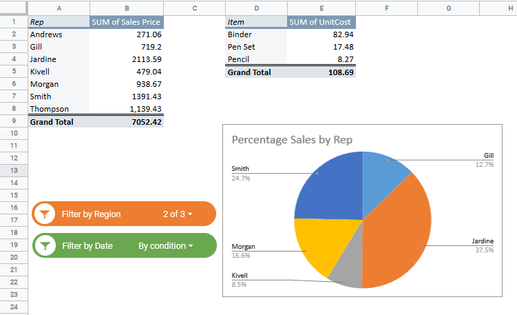
Let’s say you have the following data and would like to create a pie chart to see how much each employee contributed to the total sales:

To create a chart, simply do the following:
- Select the data
- Navigate to Insert->Chart from the menu.

- This will insert a chart and display a ‘Chart Editor’ as a sidebar to the right of your browser window.

- If you need to change the type of chart, simply select the type of chart you want by clicking on the dropdown under the Chart Type section of the Chart editor.


To learn more about making Pie Charts in Google Sheets, check out our in-depth article here.
How to Label Legends in Google Sheets Charts
There are a few things to consider when adding labels to a legend in Google Sheets. You’ll not only need to add it, but likely edit it and change positioning too.
How to Add Label to a Legend in Google Sheets
Most charts come with a label legend automatically when created. If the label legend is not already displayed, then you can add it by doing the following:
In the Chart editor, under the ‘Setup’ tab, click the ‘Add Label’ box, under the ‘Label’ section.

Select the cell range that includes your chart data.

You should see your selected data displayed as labels in your chart.

If you want to remove labels, simply uncheck the box next to ‘Use column as labels’ at the bottom of the Chart editor.

Note: At any point of time, you can make the Chart editor appear by simply double-clicking on the chart. Alternatively, you can single click on the chart, click on the three dots icon on the top left and select the ‘Edit the chart’ from the menu that appears.

Setting or Editing the Position of the Legend in Your Chart
If you don’t like how or where in your chart your legend is displayed, you can go ahead and change it as follows:
- Select the ‘Customize’ tab in the Chart editor.

- Select the ‘Legend’ section
- Click on the dropdown under ‘Position’.

- Select the position where you would like the legend to be displayed.


Note: You can also choose to not have any legend displayed by selecting the ‘None’ option from the Position options.
Formatting the Google Sheets Chart Legend
The Chart editor in Google Sheets provides a wide variety of options for you to format the text in your labels. If you want to change the font size, color, or type of legend text, then follow the instructions below:
- Select the Customize tab in the Chart editor.
- Select the Legend section.
- If you want to change the legend’s font type, click the dropdown under ‘Legend font’ and select the font you like.

4. To change the font size, click the dropdown under ‘Legend font size’ and select the font size you like.

5. To make the legend text bold or italicized, select or toggle the B and/or I buttons under ‘Legend format’.
6. To change the color of the legend text, click on the dropdown under ‘Text color’ and select the color you like.

Note: The above steps will change the text format for all the legend labels. If you want to change the text for a particular label, then simply double-click on the label in the chart legend itself. This will open the ‘Text Formatting’ options for that particular label, from where you can format accordingly.
Adding or Editing the Text in the Google Sheets Legend Labels of your Chart
You might want to change the legend label to something other than what’s showing as the default labels. Google Sheets lets you change the text for each label individually.
Here’s what you need to do:
- Double-click the specific label that you want to change within the chart.

2. This will open ‘Text formatting’ options for that individual label in the Chart editor.

3. In the input box under ‘Text label’, you can enter the text you want to replace the default label text with.

4. At this point, you can also change the formatting for that particular label by selecting your preferred font family, font size, text style, and text color.

Here’s how our chart looks after all our settings:

What to Do When the Google Sheets Legend Labels Are Not Showing
If your legend labels don’t already show any text, then you can individually add text to the legend in Google Sheets that you want to display in the labels using the same steps as shown above.
Alternatively, you may just have to make sure your titles on your spreadsheet are correctly labelled in the first place, as they are what gets automatically added to the chart.
Note: When using a column chart, the legends always reflect information about the data on the y-axis of your chart. So if you want the legend to display information about data that is along the x-axis, you will need to reverse the chart axes by clicking on the Chart editor’s Setup tab and checking the box next to ‘Switch rows/columns’ under the ‘Series’ section.
What’s Next?
Adding graphs to your worksheets not only adds visual appeal but also helps provide better insights into the underlying data. But without legend labels, it sometimes becomes difficult to understand the visualizations clearly, thereby making it difficult to make inferences.
In this tutorial, we covered everything that you need to know on how to label legends in Google Sheets charts. We hope you found it helpful.
For more information on Charting, check out our list of articles on Charts in Google Sheets.
Related: